Publishing News
Prepare a Clean Manuscript Your Book Designer Will Love
LaunchPad Books Editorial ·

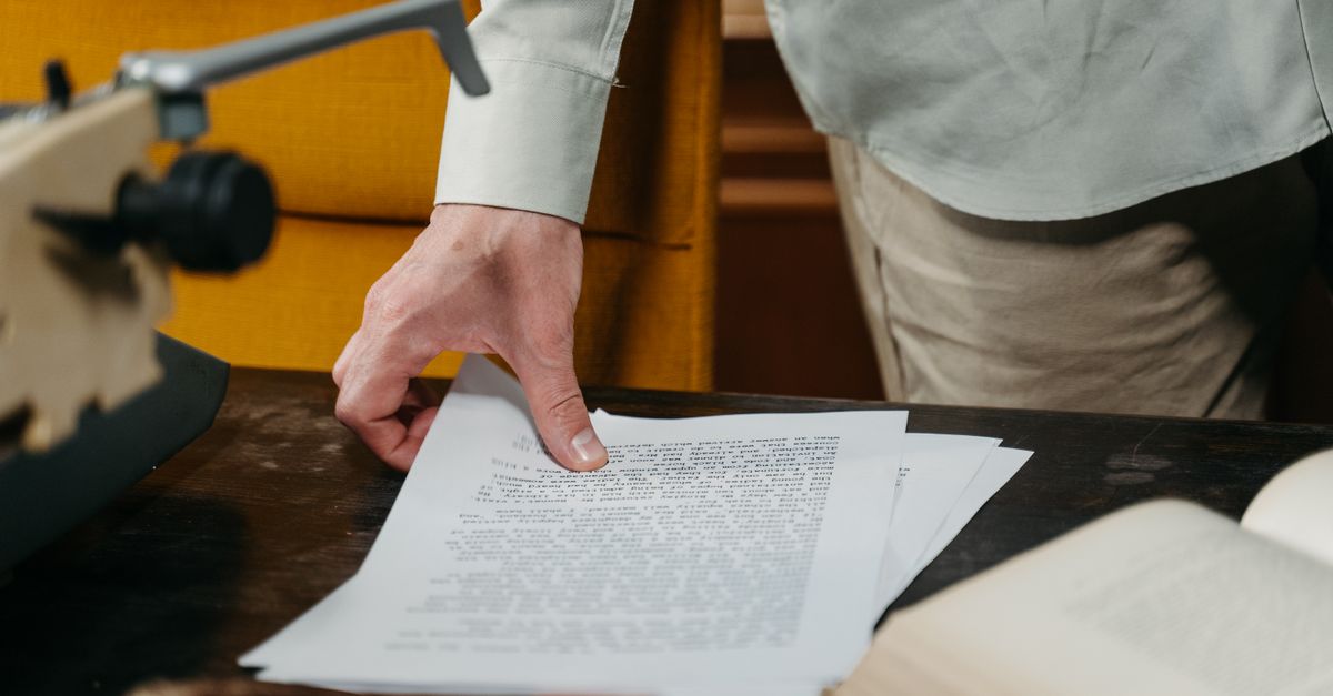
The fastest way to slow down your book — and pad the invoice — is to make your Word manuscript look like a finished book. If you have been agonizing over drop caps, dingbats, header fonts, and the perfect spacing around your em dashes, here is the blunt truth from the people who actually build books: stop. Every bit of that styling gets stripped out the moment a professional designer opens your file. What they need from you is not a pretty document. It is a clean, consistently structured one.
That single shift in mindset — from art-directing your manuscript to simply marking its structure — is what separates an author whose book sails through production from one who gets a surprise cleanup fee and a two-week delay. Below is exactly how to prepare a manuscript for a book designer so your words flow straight into the layout instead of fighting it.
Why your manuscript is not the place for design
When you hand off your edited manuscript, your designer does not lay out pages on top of your Word file. They pour your text into professional typesetting software — usually Adobe InDesign — where the real page design lives: trim size, margins, running heads, chapter openers, fonts, and spacing. Word is a writing tool. InDesign is a design tool. The two speak different languages.
So when you set a chapter title in 24-point script, add a gray sidebar box, or center an epigraph, none of that survives the trip. It either gets deleted by hand or, worse, it confuses the import and introduces errors a careful designer then has to chase down. An over-designed manuscript almost always costs more, not because the design is harder, but because removing your bling is a billable hassle.
Before you hand anything off, ask your designer one question: what can I do to make your work easier, faster, and more accurate so you can focus on design instead of cleanup? Their answer will save you more money than any formatting trick you found on YouTube.
This is the same logic behind keeping each stage of production in its own lane. Editing happens before design. Design happens in the designer's software, not your word processor. If you want a sense of how those stages fit together, our overview of the self-publishing process walks through the full path from finished draft to printed book.
Format is structure, not style
Here is the distinction that trips up most authors. Format tells the designer what a line of text is. Design decides what it looks like. Your job is the first part. The designer owns the second.
In practice, that means using Word styles — Heading 1, Heading 2, Normal, Block Quote — to label each part of your manuscript by its role. You are not choosing that Heading 1 should be 18-point bold and blue. You are telling the designer this line is a top-level heading, and they will decide how every Heading 1 looks across the entire book. Style the structure once, consistently, and the whole document becomes machine-readable to the layout software.
Consistency is the single most valuable quality of a clean manuscript. Whatever convention you choose, apply it the same way from page one to the end. A designer can adapt to almost any sensible system. What costs time is a file where chapter titles are styled three different ways and block quotes are sometimes indented, sometimes italic, sometimes both.
What to strip out before you hand off
Most of preparing a manuscript is subtraction, not addition. Remove the decoration and the manual fixes you added to fake a finished look:
- Tracked changes and comments. Accept or reject everything and clear all margin notes. Your designer should not be reading unresolved arguments between you and your editor.
- Manual page breaks and rows of blank lines used to push chapters onto a new page. The layout handles chapter starts automatically.
- Decorative fonts, font colors, and custom sizes for headings, drop caps, or emphasis.
- Sidebars, text boxes, gray shading, and dingbats you added as visual flourishes.
- Manual page numbers, headers, and footers. These are generated in the layout.
- Hand-tuned spacing around em dashes or fixes for widows and orphans. The designer controls all of it.
What to keep and mark clearly
Keep the things that carry meaning: italics for emphasis and titles, bold where it genuinely matters, and your structural styles. Real semantic formatting tells the designer something true about the text. Cosmetic formatting just gets in the way.
| Element in your manuscript | Leave it to the designer? | What you should do |
|---|---|---|
| Chapter title fonts and sizes | Yes | Mark it as Heading 1, nothing more |
| Drop caps and chapter ornaments | Yes | Do not add them; discuss the look up front |
| Page numbers and running heads | Yes | Delete any you added manually |
| Italics for titles and emphasis | No | Keep them — they carry meaning |
| Block quotes and epigraphs | Partly | Mark the style; let the designer set the look |
| Image placement | Partly | Add a bracketed callout; send files separately |
Decide the big stuff with your designer first
Some choices need to happen before design begins because they reshape everything else. The most important is trim size — the finished dimensions of your pages, such as 6 by 9 inches or 5.5 by 8.5. Trim size is driven by your genre, your page count, and reader expectations, and it ripples into margins, spine width, and even how many pages your book runs.
This is where most guides go quiet, so here is the insider point: page count and trim size are linked, and that link affects your printing cost. A short book set at a large trim can leave the spine too narrow to carry text, while a generous trim with wider margins can give a thin book the heft readers expect on a shelf. Designers know these tricks, but they can only apply them if they understand your goals. Settle the format, cover type — soft, hard, or jacketed — and which versions you need before the layout starts. If you plan a print-on-demand paperback plus an ebook edition, say so up front, because each format carries its own design constraints. The same goes for an audiobook down the line — knowing the full plan early prevents rework later.
How to handle images, photos, and graphics
Never paste high-resolution images into your Word file and assume they will print well. Pasted images are compressed and the placement is meaningless once the text reflows. Instead, mark each image with a bracketed callout exactly where it belongs in the text, like this: [photo 35.jpg: My sister on the left and I hiked the Grand Canyon in 2016.]
Inside that bracket, include the file name, the caption, and, if you are producing an EPUB, the alt text for accessibility. Then deliver the actual images as separate high-resolution files in a clearly numbered folder, with names that match your in-text callouts. Print images are large, so send them through Dropbox, Google Drive, or another transfer service rather than email. This way the designer can place the right image in the right spot at full quality, with zero guesswork.
A simple pre-handoff checklist
Run through this before you send anything. It takes twenty minutes and prevents the most common — and most expensive — production headaches.
- Accept all tracked changes and delete every comment.
- Apply Word styles consistently for headings, body, and block quotes.
- Remove manual page breaks, blank-line padding, manual page numbers, and headers.
- Strip decorative fonts, colors, sizes, boxes, and ornaments.
- Keep meaningful italics and bold.
- Replace embedded images with bracketed callouts and gather the real files separately.
- Ask your designer for their specific preferences and follow them.
Do these seven things and you have done the hard part. A clean file means your designer spends their hours on craft — the cover, the typography, the reading experience — rather than janitorial cleanup. That is where the value of professional cover and interior design actually shows up. And if your manuscript still needs a polish before any of this, a round of professional editing first will make the structure even cleaner to mark.
At LaunchPad Books, we help authors prepare, publish, print, and promote their books while keeping every right and every royalty — and a designer-ready manuscript is the first step toward a book that looks like it belongs in any store. If you are ready to turn a clean Word file into a professionally designed, print-ready book, start your project with our team and let us handle the typesetting, cover, and production while you focus on the writing. Tell us your genre, trim size, and timeline, and we will map out exactly what your manuscript needs next.
Source: Jane Friedman
Ready to publish your book?
Talk to a real publishing advisor — free, no pressure.
Frequently asked questions
Should I format my manuscript to look like a finished book?
No. A designer rebuilds the entire layout in software like InDesign, so any fonts, drop caps, page numbers, or boxes you added in Word get stripped out. Send a clean, consistently styled file instead — it costs less and prevents typesetting errors.
What is the difference between formatting and design in a manuscript?
Formatting tells the designer the structure of your text — which lines are headings, body, captions, or block quotes. Design is the visual look — fonts, spacing, ornaments. Authors should mark structure with Word styles and leave all design decisions to the book designer.
How do I mark images and photos in my Word manuscript?
Place a bracketed callout where the image belongs, such as [photo 35.jpg: My sister and I at the Grand Canyon, 2016], including the file name, caption, and alt text for EPUB. Deliver the actual high-resolution files separately in a clearly numbered folder via Dropbox or Google Drive.
Do I need to fix widows, orphans, and page breaks myself?
No. Do not add manual page breaks, extra blank lines, or line-spacing fixes for widows and orphans. The designer controls all of that in the page layout. Manual breaks actually create work because they have to be hunted down and deleted before typesetting.