Publishing News
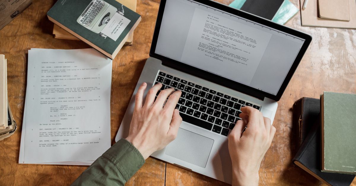
Prepare a Clean Manuscript for Your Book Designer
LaunchPad Books Editorial ·

Send your book designer a clean Word file that uses paragraph styles to mark structure — and nothing else. No hand-picked fonts, no colored headers, no gray boxes, no manual page breaks, no double spaces around em dashes. The single most useful thing you can do is tag what each paragraph is (a chapter title, body text, a block quote) and let the designer decide how it looks. Do that, and your text pours into their layout cleanly. Skip it, and you pay — in time, in errors, and often in a literal cleanup fee.
This trips up more authors than almost any other handoff in self-publishing, because the instinct is exactly backwards. You spent months in your manuscript. You made it pretty. Surely a polished-looking file helps the designer? It does the opposite. Here is how the handoff actually works, and how to prepare files a designer will thank you for.
The manuscript is not the place for design
Your designer builds the finished interior in professional layout software — almost always Adobe InDesign for print. Your Word document is raw material that flows into a custom framework they have already built: trim size, margins, fonts, chapter-opening treatment, running heads, the works. When your text arrives, all your decorative choices get stripped out anyway. The flourishy drop-cap font you pictured, the dingbats, the three sizes of bold blue headings — poof. Gone before the real work starts.
So every minute you spent art-directing in Word was wasted, and worse than wasted if it slows the designer down. An over-designed manuscript is harder to clean than a plain one, and many designers charge for that hassle. You are quite literally paying extra to make their job harder.
Format tells the designer what a line is — a heading, body text, a caption, a block quote. It does not tell them what it should look like. That is the designer's job, decided with you in advance, not buried inside your Word file.
Use Word styles — this is the whole game
Here is the part most guides gloss over: the way you mark structure is through Word's built-in paragraph styles, not through manual formatting that happens to look the same. Selecting a line and clicking bold, 18pt, centered looks like a heading to your eye. To the software, it is still body text wearing a costume. Apply the Heading 1 style to it instead, and now the file carries real structural information the designer can map straight to their chapter-title style in one move.
A practical, designer-friendly setup looks like this:
| Element in your book | Word style to apply | What you must NOT do |
|---|---|---|
| Chapter title | Heading 1 | Manually enlarge, recolor, or center it |
| Section or subhead | Heading 2 (and Heading 3 if needed) | Invent your own font sizes per level |
| Normal paragraph | Body Text or Normal | Add blank lines between paragraphs |
| Block quote or epigraph | Quote | Hand-indent with tabs or spaces |
| Photo caption | Caption | Italicize and resize by hand |
Consistency matters more than perfection. Whatever convention you choose, apply it the same way from the first page to the last. A designer can remap a consistent Heading 2 in seconds; a manuscript where chapter openings are styled five different ways forces them to inspect every single one.
Stop fixing things that are not your job
Authors who know just enough to be dangerous often introduce the worst problems, because they have read that widows and orphans are bad and decided to fix them. Don't. Line spacing, page breaks, widow and orphan control, hyphenation, and justification are all typesetting decisions the designer owns. When you force them in Word, they get overridden, and the stray returns and manual breaks you left behind become invisible landmines in the layout.
The specific habits to drop:
- No manual page breaks to start new chapters. Let the Heading 1 style and the designer's template handle chapter openings.
- No extra returns — never tap Enter several times to push content down a page. One return ends a paragraph; that is all.
- No double spaces after periods, and no spaces padding your em dashes. One space between sentences; em dashes sit tight against the words unless your style guide says otherwise.
- No tabs or spaces to fake an indent. First-line indents come from the paragraph style.
- No page numbers, headers, or footers. The designer generates running heads and folios from scratch.
- No tracked changes and no margin comments in the final file. The designer is not there to referee leftover questions between you and your editor — resolve all of that during professional editing first.
Think of it this way: every embellishment you add is something a human has to find and remove before design can begin. The cleanest file is the cheapest file.
How to hand off images the right way
Images cause more handoff chaos than text, so handle them deliberately. Do not paste photos into the Word document. Instead, mark each placement with a clear in-text callout and deliver the real files separately.
In the manuscript, drop a bracketed note exactly where the image belongs, including the filename, a caption, and — if you are producing an EPUB for ebook publishing — alt text for accessibility. For example: [photo 35.jpg: My sister (left) and I hiked the Grand Canyon in 2016.]
Then provide the actual high-resolution graphics as separate files in a folder, named and numbered to match every callout. Print images run large, so send them through Dropbox, Google Drive, or another transfer service rather than choking an email inbox. Aim for at least 300 DPI at final print size; web-resolution screenshots pulled at 72 DPI will look muddy on paper and a good designer will reject them.
Settle the big decisions before design starts
The most efficient projects begin with a conversation, not a file dump. Before a designer touches your text, they need to know the destination. Trim size (6 x 9, 5.5 x 8.5, or something else), cover type (softcover, hardcover, or jacketed), and which formats you are producing — paperback, hardcover, ebook, and audiobook — all change the design from the ground up.
These are not arbitrary. They are driven by comparable titles in your genre, bookstore and reader expectations, and your page count. Specify too large a trim for a short book and the spine gets too narrow to even print legible text; a designer might widen your margins or adjust leading to bulk a thin book to a respectable spine. These are the tricks of the trade — but the designer can only apply them if they understand your goals up front. The same coordination matters for cover design, where spine width depends on final page count and paper stock.
What most authors get wrong about Vellum and Atticus
Here is the information-gain point worth internalizing. Tools like Vellum and Atticus are genuinely excellent — for authors who are their own designer and want a polished, template-driven interior without hiring anyone. If that is your path, format directly in those tools and export print-ready files. But if you have hired a professional for a custom layout, do not pre-typeset in Vellum and then hand over the export. You are giving them a finished-looking file they have to tear apart to rebuild properly. Send the clean Word manuscript instead. Pick one path — author-designed or professionally designed — and prepare files for that path, not a confused hybrid.
A quick pre-handoff checklist
Before you send anything, run through this:
- Every chapter title uses Heading 1; every subhead uses Heading 2 or 3 — consistently.
- Body text is a single style, with indents and spacing coming from the style, not your keyboard.
- No manual page breaks, no strings of empty returns, no double spaces, no padded em dashes.
- No page numbers, headers, footers, tracked changes, or margin comments.
- Image callouts are bracketed in place; high-res files sit in a matching, clearly named folder.
- Trim size, cover type, and output formats are agreed with your designer in writing.
Get those six right and you have done your entire job. The designer focuses on craft instead of cleanup, your timeline shrinks, your invoice stays predictable, and your finished interior looks like it was built by a pro — because it was.
At LaunchPad Books we help authors publish, print and promote their books while keeping every right and every royalty, and a clean manuscript handoff is where a great-looking book begins. If you want experienced editors and designers to turn your finished draft into a professionally typeset interior and a cover that sells, start your project with us for a no-pressure consultation — or explore our print-on-demand and book printing options to see your manuscript become a real book in your hands.
Source: Jane Friedman
Ready to publish your book?
Talk to a real publishing advisor — free, no pressure.
Frequently asked questions
What file format should I send my book designer?
Send an editable Word document (.docx) for the text, not a PDF or a Vellum export. Provide images as separate high-resolution files in a folder, named to match in-text callouts, and share large image sets through Dropbox or Google Drive rather than email.
Should I format my manuscript in Vellum or Atticus before sending it to a designer?
No. Vellum and Atticus are typesetting tools for authors who self-design. If you have hired a professional designer for a custom interior, send a clean Word file instead. Their finished layout is built in InDesign, and an exported Vellum file just creates cleanup work.
Do I need to fix widows and orphans in my Word manuscript?
No. Widows, orphans, line spacing, and page breaks are typesetting decisions the designer controls in their layout software. Manually adjusting them in Word gets stripped out and can introduce errors. Focus only on tagging structure correctly and staying consistent.
How much does messy manuscript formatting cost me?
It depends on the designer, but overly formatted files often add a cleanup surcharge or billable hours, sometimes a few hundred dollars, because someone has to strip your fonts, boxes, and stray returns before real design can start. A clean file avoids that entirely.