Publishing News
Prepare a Clean Manuscript Before Your Book Designer Starts
LaunchPad Books Editorial ·

The cleanest manuscript is the one you did not decorate
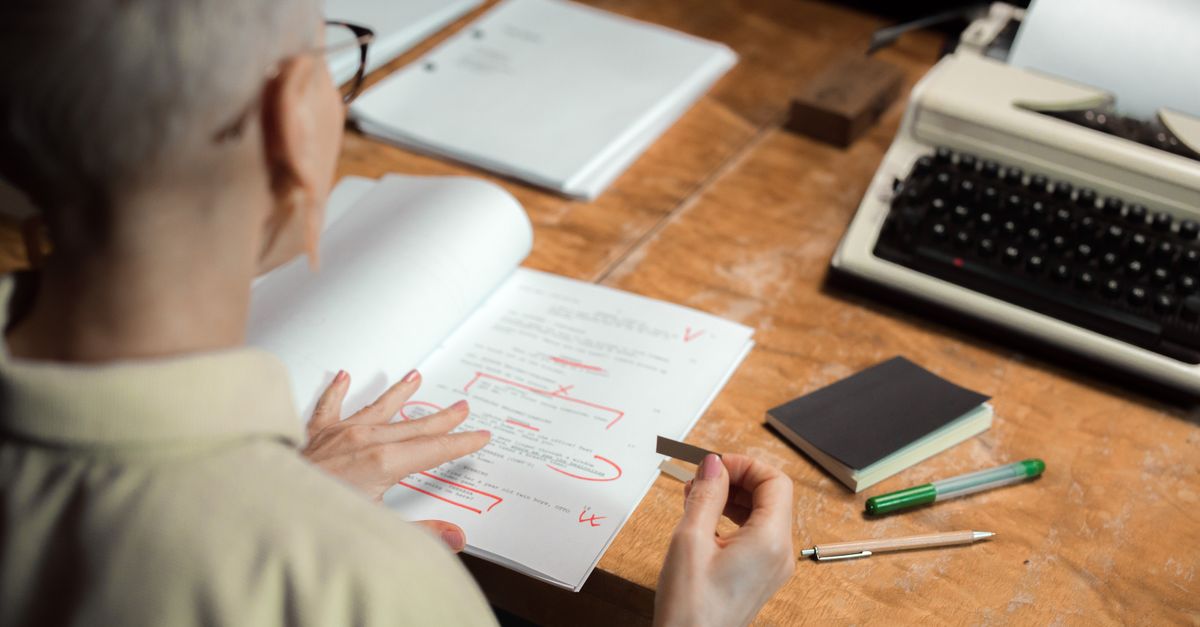
Here is the short version your designer wishes you knew before you hit send: stop prettying up your Word file and just write the book. Every flourishy drop cap, colored heading, gray sidebar box, and hand-tuned line space you lovingly added gets stripped out during professional typesetting. It vanishes. The manuscript is not the place for your aesthetic — it is the place for clean, consistent structure that flows into a designer's software without a fight.
This matters for one practical reason: an over-designed manuscript usually costs you more. Designers either charge for the hours spent undoing your formatting, or they quietly inherit errors when stray codes and manual spacing collide with their layout. Either way, you lose time and money on cleanup that should have gone into actual design. Learning how to prepare a manuscript for a book designer is one of the highest-return skills an indie author can pick up before moving into self-publishing.
Format tells the structure — design decides the look
The single idea that fixes most author mistakes is this distinction: format is not design. Formatting tells the designer what a line is — a chapter heading, a subheading, body text, a caption, an epigraph, a block quote. Design is what that element looks like on the page, and that decision belongs to the designer working in a tool like InDesign.
When you make a heading bigger and bold because you think chapter titles should look important, you have given the designer a styling opinion, not structural information. When instead you tag that line as Heading 1 using Word styles, you have told the designer exactly what it is and let them control how every Heading 1 renders across the whole book. That is the difference between a file that flows in cleanly and a file that has to be rebuilt.
Consistency is the most important feature of a clean manuscript. Whatever you do to mark structure, do it the same way every single time — one method for chapter titles, one for body text, one for block quotes, start to finish.
Decide the big things before you format anything
Before formatting questions even matter, the designer needs the foundational decisions that shape everything downstream. The most important is trim size — the finished dimensions of the printed page, commonly 6 x 9 or 5.5 x 8.5, though plenty of books use something else. Trim size interacts with page count in ways most authors never consider.
A short book forced into a large trim can end up with a spine too narrow to carry text, while a long book in a small trim balloons the page count and the printing cost. Designers use tricks like wider margins to bulk up a thin book, or tighter leading to rein in a long one. They also need to know cover type (softcover, hardcover, or jacketed) and which formats you are producing, because a layout built for print-on-demand paperback is not automatically the right source for an ebook or audiobook edition.
These choices are driven by comparable titles, bookstore norms, and reader expectations for your category — a literary memoir and a business leadership book do not share the same physical conventions. Settle them with your designer first, then format. If you are still mapping out the full path from finished manuscript to printed and distributed book, it helps to start with a clear production plan rather than guessing.
What to strip out of your Word file
Most cleanup is subtraction. The goal is a file that carries your words and your structure, nothing else. Here is what to pull before handoff.
- Tracked changes and margin comments. Accept or reject every edit so the document is final. The designer is not there to resolve lingering questions between you and your editor — that conversation should be closed before the file leaves editing.
- Decorative fonts and color. Special heading fonts, drop-cap fonts, colored text, and dingbats all get discarded. Remove them.
- Manual page breaks made with returns. Do not press enter repeatedly to push a chapter onto a new page. Use a single proper page break, or better, let the designer's chapter styling handle it.
- Hand-added page numbers and headers and footers. The layout software generates these. Yours will only conflict.
- Manual spacing fixes. Extra spaces around em dashes, double spaces after periods, and tab-built indents all create noise. One paragraph style controls indentation cleanly.
- Forced fixes for widows and orphans. You do not need to nudge lines to avoid a stranded word at a page top or bottom — that is a typesetting decision the designer makes in layout, and your manual nudges only get undone.
How to mark the things that do matter
Subtraction handles the mess. The positive work is marking structure so it survives the move into design software. Use Word's built-in styles rather than ad hoc formatting: apply Heading 1 to chapter titles, Heading 2 to major sections, and a consistent style for body text, captions, and block quotes. When the file imports, the designer can map each style to a designed equivalent in one pass instead of hunting line by line.
Images need their own discipline. Do not embed final art in the Word file. Instead, drop a bracketed callout exactly where the image belongs, like this: [photo 35.jpg: My sister on the left and I hiked the Grand Canyon in 2016.]. Include the file name, the caption, and, if you are producing an EPUB, the alt text for accessibility. Then deliver the real high-resolution images as separate files in a folder, named to match each callout. Print images are large, so move them through Dropbox, Google Drive, or another transfer service rather than stuffing them into the manuscript.
A quick reference: keep, cut, or supply separately
| Element | What to do | Why |
|---|---|---|
| Chapter and section headings | Tag with Word styles (Heading 1, Heading 2) | Lets the designer map structure in one pass |
| Body text indentation and spacing | Control with one paragraph style | Manual tabs and spaces cause import errors |
| Decorative fonts, drop caps, color | Remove entirely | Stripped during typesetting anyway |
| Tracked changes and comments | Accept or reject, then delete | The file must be final, not in-progress |
| Page numbers, headers, footers | Remove | Generated by the layout software |
| Images and graphics | Supply as separate high-res files with callouts | Print files are too large to embed and need matching names |
What most guides get wrong about manuscript prep
The advice you usually hear is a tidy checklist of dos and donts. The deeper insight is that the clean-manuscript problem is really a communication problem. The single best move an author can make is to ask the designer one question before formatting anything: What can I do to make your work easier so you can focus on design instead of cleanup? Every designer has preferences, and ten minutes of asking saves hours of guessing.
The second thing guides miss is that beautiful-in-Word and ready-for-design are often opposites. Authors who lovingly style their pages in Word, Vellum, or Atticus feel a real sense of accomplishment looking at the result — and then feel real disappointment when a professional designer strips it all out. That satisfaction is a trap. The page you admire in Word is not the page readers will see; the designer builds that one. Your job is to hand over words and structure so clean that the designer can spend their budget on craft, not janitorial work.
Get this right and the payoff compounds. A clean file means fewer rounds, fewer introduced errors, lower cost, and a faster path to a finished book you can actually pair with a professional cover and send to print.
Ready to hand off a manuscript your designer will love?
You write the book — let a professional team turn it into a beautifully typeset, print-ready product while you keep every right and every royalty. LaunchPad Books helps authors publish, print, and promote without giving up ownership, from interior layout and cover design through print-on-demand and distribution. If you are close to handoff and want your files reviewed or your full production mapped out, get started with a free consultation and move from clean manuscript to finished book with people who do this every day.
Source: Jane Friedman
Ready to publish your book?
Talk to a real publishing advisor — free, no pressure.
Frequently asked questions
Should I design my manuscript in Word before sending it to a designer?
No. Any decorative fonts, drop caps, colored headers, or boxed sidebars you add in Word get stripped out during professional typesetting. Worse, heavy formatting often costs you more because the designer has to clean it up before real design can begin. Send structure, not styling.
What is the difference between formatting and design in a manuscript?
Formatting tells the designer what each line is — a chapter title, a subheading, body text, a caption, or a block quote. Design is how those elements look on the finished page, and that is the designer's job inside software like InDesign. Your file should communicate structure, never aesthetic preference.
How do I include images in a manuscript for the designer?
Place a bracketed callout in the text where the image belongs, such as [photo 35.jpg: caption here], and deliver the actual high-resolution files in a separate folder with names that match the callouts. Print images are large, so share them through Dropbox or Google Drive rather than embedding them in Word.
What should I remove from my Word file before handing it off?
Remove tracked changes, accept or reject all edits, delete margin comments and editorial notes, strip manual page numbers, and clear out extra returns used to force page breaks. Decide on trim size, cover type, and formats with your designer first, since those choices shape every later decision.