Publishing News
Prep Your Manuscript for a Book Designer the Right Way
LaunchPad Books Editorial ·
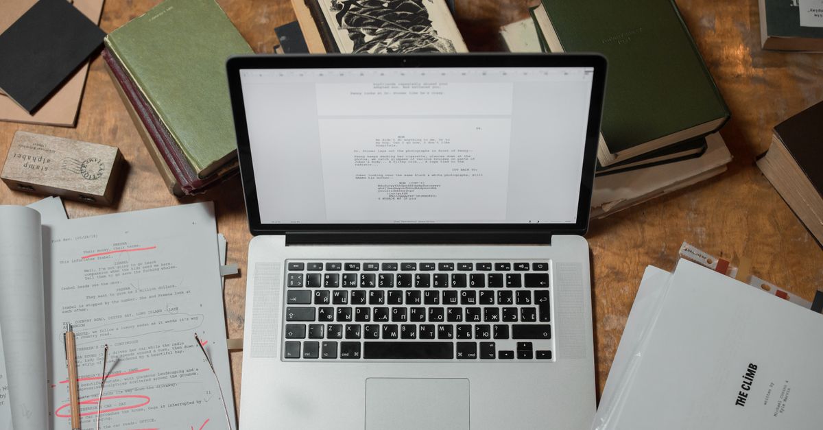
Stop styling your manuscript. The decorative fonts, the gray boxes, the carefully centered epigraphs, the page numbers you added by hand — a professional book designer deletes all of it before they begin. The single most useful thing you can do is hand off a clean Word file that marks structure, not appearance, and let the designer build the look.
This trips up more authors than almost anything else in production. You spend weeks making your pages look beautiful in Word, Atticus, or Vellum, then ship the file to a designer and watch your aesthetic vanish. Worse, an over-decorated manuscript often costs you more, because someone has to strip out your formatting before the real work starts.
Here is how the handoff actually works, and how to prepare a file your designer will thank you for.
Formatting is not design — and that distinction saves you money
These two words get used interchangeably, and the confusion is the root of the problem.
Format tells the designer what each line is: this is a chapter title, this is a subheading, this is body text, this is a block quote, this is a caption. Design is how those elements look: the typeface, the point size, the drop cap, the spacing, the ornament between scene breaks.
Your job as the author or editor is the first one. You mark structure. The designer makes the second set of decisions when they typeset the interior, usually in Adobe InDesign. When your Word file is clean and consistently structured, it flows straight into that software framework. When it is full of manual overrides, the designer has to undo your work before they can do theirs.
So the rule is simple: indicate what something is, never what it should look like.
Use Word styles instead of styling by hand
The professional way to mark structure is with Word paragraph styles — the Heading 1, Heading 2, Normal, and Quote entries in the Styles gallery. Apply them consistently and your designer can map each one to a corresponding design treatment in seconds.
The amateur way is to select text and bump the font size to 18pt, make it bold, center it, and call it a chapter heading. That tells the software nothing useful. It just creates manual overrides the designer has to find and clear.
Here is how to think about the common elements:
- Chapter titles: apply Heading 1. Do not increase the size or add a fancy font.
- Subheadings: apply Heading 2 (and Heading 3 for a deeper level). Be consistent about which level means what.
- Body text: leave it as the default Normal style. One typeface, one size, left aligned or justified — your choice does not matter because it gets reset.
- Block quotes and extracts: apply the Quote style so the designer knows to indent and treat them as a set-off passage.
- Scene breaks: mark them with a simple centered symbol like three asterisks on their own line, the same way every time.
Consistency is the single most important feature of a clean manuscript. Whatever convention you choose, apply it identically from the first page to the last. A designer can adapt to almost any system, as long as it never changes mid-book.
What to strip out before you send the file
Most of the effort in preparing a manuscript is removal, not addition. Here is what does not belong in the file you hand off, and why.
| What authors add | What the designer does with it | Do this instead |
|---|---|---|
| Decorative fonts, drop caps, dingbats | Deletes them and chooses type during layout | Leave one plain typeface throughout |
| Colored text, gray sidebars, shaded boxes | Strips the color and rebuilds the box as a design element | Mark the passage with a style or a bracketed note |
| Manual page breaks and rows of empty enters | Removes them; chapters break by design rule | Use one page break per chapter only if asked |
| Double spaces between sentences | Has to find and replace them all | Use single spaces; run find and replace yourself |
| Spaces around em dashes | Cleans them up to match the house style | Set em dashes the way your style guide specifies |
| Page numbers, headers, footers | Discards them; the layout generates its own | Leave them out entirely |
| Tracked changes and margin comments | Is not there to settle editorial questions | Accept or reject all changes first |
That last row deserves emphasis. The designer is not your editor. Lingering tracked changes and comments between you and your editor have no place in the final file, and leaving them in is a common way to introduce errors into the printed book. Finish editing first, then accept all changes and clear every comment. If your manuscript still needs a polish, that is a job for professional editing before design begins, not something to resolve in the designer's software.
Everything you adjust to make widows, orphans, line spacing, and pull quotes look right in Word gets discarded in layout — and can introduce errors. Those are design decisions. Leave them to your typesetter and focus only on clean, consistently structured text.
Decide the trim size and format before design starts
Before a designer places a single word, they need to know the finished shape of the book. These choices change every design option, so settle them early.
The big ones are the trim size (6 x 9, 5.5 x 8.5, or something else), the cover type (paperback, hardcover, or jacketed hardcover), and which versions you are producing — print, ebook, audiobook, or all three.
These are not arbitrary. Trim size is guided by comparable titles in your genre, bookstore and reader expectations, and the length of your book. Specify too large a trim for a short manuscript and the spine can end up too narrow to print text on. Designers know the tricks — bulking a short book with wider margins, adjusting leading, choosing a slightly larger type size — but they need to understand your goals to apply them. If you are weighing how each format affects cost and reach, our overview of self-publishing and the options for book printing will help you decide before you commit to a layout.
Ask one question that changes everything
Before you export your file, ask your designer directly: what can I do to make your work easier, faster, and more accurate, so you can focus on design instead of cleanup? Different designers have different preferences, and a two-minute conversation up front prevents hours of back-and-forth later. It is the highest-leverage thing most authors never do.
How to handle images the right way
Never paste high-resolution images into your Word document. Print images are large, they bloat the file, and Word degrades them anyway.
Instead, mark placement with a bracketed callout right where the image belongs. A clear convention looks like this: open bracket, the file name, a colon, then the caption and — for an EPUB — the alt text. For example: photo 35.jpg followed by a short description of who is in the shot and where it was taken.
Then deliver the actual images as separate high-resolution files in a folder, named or numbered to match each in-text callout exactly. Because print image files are big, send them through Dropbox, Google Drive, or another transfer service rather than email. This keeps your text file lean and lets the designer place each image precisely where your callout points.
A quick pre-flight checklist before you hand off
Run through this before you send anything. It takes ten minutes and saves days.
- Accept or reject all tracked changes and delete every comment.
- Apply consistent paragraph styles for headings, body, and quotes.
- Remove decorative fonts, colors, boxes, and manual spacing.
- Find and replace double spaces with single spaces.
- Delete page numbers, headers, and footers.
- Replace any image you pasted in with a bracketed callout and a separate file.
- Confirm the trim size, cover type, and formats with your designer.
Do these seven things and you hand over a manuscript that flows cleanly into layout, costs less to typeset, and comes back with fewer errors. The time you would have spent prettying up Word is far better spent writing the next chapter.
At LaunchPad Books, we help authors prepare, design, print, and promote their books while keeping every right and every royalty — so the file you hand off becomes a finished book you are proud of, without surrendering control of your work. If you are ready to turn a clean manuscript into a professionally designed title, explore our cover and interior design and print-on-demand services, or get started with a free consultation and we will map out the right format, trim size, and timeline for your book.
Source: Jane Friedman
Ready to publish your book?
Talk to a real publishing advisor — free, no pressure.
Frequently asked questions
Should I design my manuscript in Word before sending it to a designer?
No. A book designer strips out manual formatting and rebuilds the look in professional software like InDesign. Decorative fonts, colored text, gray boxes, and custom spacing all get deleted, and an over-styled file often costs you more because the designer has to clean it first. Send a plain, consistent Word file that uses styles to mark structure.
What is the difference between formatting and design in a manuscript?
Formatting tells the designer what each element is — a chapter heading, a subheading, body text, a block quote, a caption. Design is how those elements look — the typeface, size, spacing, and ornamentation. You handle formatting by applying Word paragraph styles consistently. Your designer handles design when they typeset the book. Keep the two jobs separate.
How do I mark image placement in a Word manuscript?
Do not paste high-resolution images into the Word file. Instead, type a bracketed callout where the image belongs, such as the file name plus the caption and alt text. Then deliver the actual images as separate high-resolution files in a folder, named to match each in-text callout, and share them through Dropbox or Google Drive.
Do I need to fix widows, orphans, and page breaks myself?
No. Widows, orphans, line spacing, page breaks, and pull-quote placement are all design decisions your typesetter controls in their layout software. If you adjust them in Word, your work is discarded and can even introduce errors. Leave those choices to the designer and focus on clean, consistent text.