Publishing News
Prep a Clean Manuscript Your Book Designer Will Love
LaunchPad Books Editorial ·
Write the book — not the layout
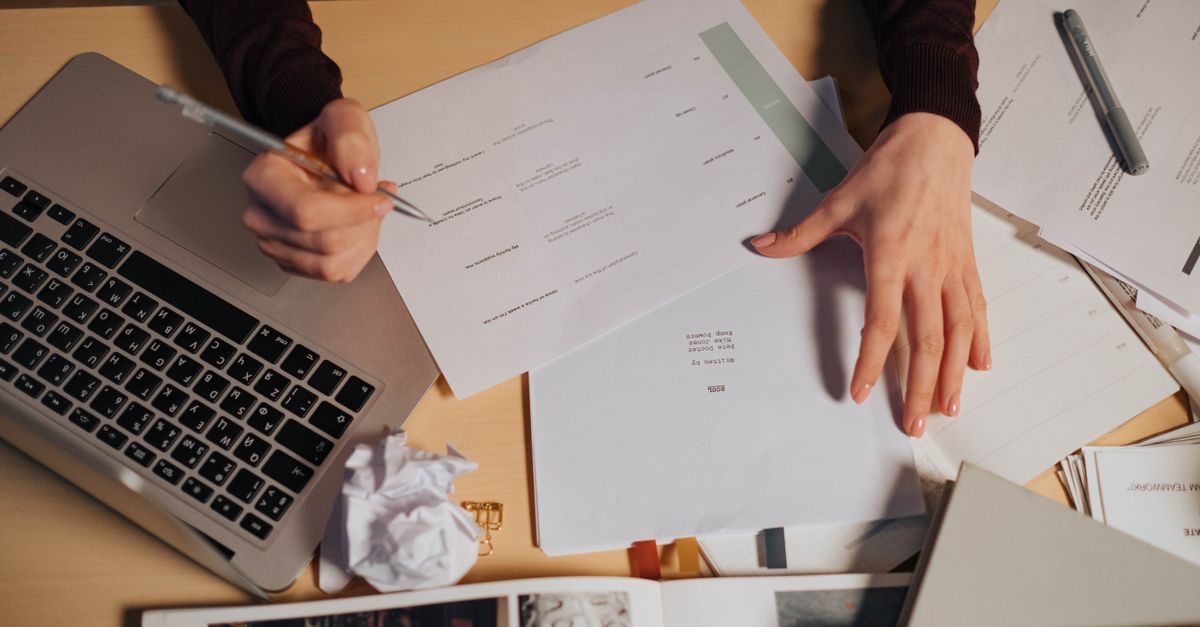
The single most useful thing you can do for your book designer is send a clean, plainly formatted Word document and let go of the urge to make it look pretty. Decorative fonts, drop caps, colored headers, gray boxes, manual page breaks, and double-spaced em dashes all get stripped out the moment your file enters professional design software. The manuscript is for structure and words. The design happens later, in a different program, by someone whose whole job is making your pages beautiful.
This is the part most authors get backwards. You spend hours nudging spacing and choosing a flourishy chapter font, then feel deflated when none of it survives. Worse, that extra styling often slows your designer down and quietly raises your quote, because someone has to undo it all before real layout can begin.
Why your fancy formatting gets deleted anyway
Here is what actually happens behind the scenes. Your designer imports your Word file into a page-layout program — usually Adobe InDesign — and applies a custom template built specifically for your book. That template controls the body font, the chapter openers, the running heads, the margins, and the spacing. When your text flows in, the template wins. Your hand-applied fonts and colors are overwritten or discarded.
So the gray box you lovingly built around a sidebar? Gone. The three different header sizes you picked? Replaced by the designer's heading hierarchy. The page numbers you added? Deleted, because InDesign generates its own. Every minute you spent art-directing in Word was, unfortunately, wasted — and possibly counterproductive.
What a designer needs from you instead
Designers do not need your taste in fonts. They need your structure. Format, in this context, is not decoration — it tells the designer what each line is: a chapter title, a subheading, body text, a block quote, a caption. That structural information is what lets your manuscript flow cleanly into a layout. The way to communicate it is through Word's built-in styles, not visual guesswork.
Consistency is the most important feature of a clean manuscript. Whatever you do to preformat, do it the same way every single time — one body style, one heading style per level, applied from the first page to the last.
The clean manuscript checklist
Before you hand off your file for professional editing or design, run through this. None of it takes design skill — just discipline.
- Use Word heading styles. Apply Heading 1 to chapter titles and Heading 2 to subheads instead of manually enlarging and bolding text. This is the structural map your designer reads.
- One space after periods. Not two. The double-space habit creates uneven gaps in justified type.
- No manual page breaks for chapters. Do not press Enter twenty times to push a chapter to a new page. The template handles chapter starts automatically.
- Skip page numbers, headers, and footers. The layout software generates these.
- Use real em dashes — like this — with no spaces around them, applied the same way throughout.
- Turn off all tracked changes and delete margin comments. Accept or reject every edit first.
- One font, one size. A standard serif at 12 point is perfect. Resist colors, highlights, and special characters.
Do this, not that
| What authors love to do | What the designer actually wants |
|---|---|
| Bold and enlarge chapter titles by hand | Apply the Heading 1 style |
| Insert decorative drop-cap fonts | Leave openers plain; flag them in a note |
| Build gray boxes around sidebars | Tag the text as a sidebar and let design style it |
| Add page numbers and running heads | Nothing — the software generates them |
| Paste images into the Word file | Send high-resolution files separately |
| Press Enter to break pages | Use one chapter heading style; no manual breaks |
Mark images the right way
Never paste photos, charts, or illustrations directly into your Word manuscript. Low-resolution pasted images are useless for print and bloat the file. Instead, leave a clear placement callout in the text exactly where the image belongs, formatted like this: [photo-35.jpg: My sister (left) and I hiked the Grand Canyon in 2016]. Include the file name, a caption, and alt text if you are producing an EPUB.
Then deliver the real images as separate, high-resolution files in their own folder, named or numbered to match every in-text callout. Print images are large, so use Dropbox, Google Drive, or another transfer service rather than email. If you are heading toward professional print production, your designer will tell you the minimum resolution and color format they need — usually 300 dpi and CMYK for interior art.
Settle the book specs before design begins
Here is the insight most formatting guides skip: design decisions start before a single page is laid out, and they depend on physical specs you should discuss up front. Your trim size, cover type, and format mix shape every layout choice that follows.
| Decision | Why it matters |
|---|---|
| Trim size (6 x 9, 5.5 x 8.5, etc.) | Drives margins, line length, and page count |
| Cover type (soft, hard, jacketed) | Affects spine math and production cost |
| Formats (paperback, hardcover, ebook, audiobook) | Each needs its own treatment and files |
| Final word count | A short book in a large trim can leave the spine too thin for text |
Designers use real tricks of the trade here — slightly wider margins to bulk up a short book, or a tighter trim to keep a long one affordable. But they can only apply them when they understand your goals. Ask early, and ask the most useful question there is: what can I do to make your work easier and more accurate, so you can focus on the design instead of the cleanup?
When clean files pay off
A tidy manuscript does more than save money. It reduces the back-and-forth, lowers the odds of errors creeping in during layout, and gets your finished interior to you faster. That same discipline carries through the whole production chain — from cover design to self-publishing and distribution. The cleaner your starting file, the smoother every step that follows.
This is exactly the kind of behind-the-scenes craft that separates a polished, professional book from one that looks self-made. At LaunchPad Books, we help authors handle this entire pipeline — editing, interior typesetting, print, and promotion — while you keep every right and every royalty to your work.
Ready to turn your clean manuscript into a finished book? Let our editors and designers take it from your final Word file to print-ready pages and a cover that sells. Get started with a free consultation and we will map out the trim size, formats, and timeline that fit your book — so you can get back to doing the one thing only you can do: writing the next one.
Source: Jane Friedman
Ready to publish your book?
Talk to a real publishing advisor — free, no pressure.
Frequently asked questions
Should I add page numbers and fancy fonts to my manuscript?
No. Page numbers, decorative fonts, drop caps, colors, and gray boxes all get stripped out when your file is imported into design software. Send plain, consistently formatted text and let the designer handle the visual layout.
What file format do book designers prefer?
A clean Microsoft Word document (.docx) is the industry standard. Designers flow Word text into InDesign, so a tidy Word file with proper heading styles imports cleanly. Send images as separate high-resolution files, never pasted into the Word document.
How do I mark images for the designer in my manuscript?
Place a bracketed callout where the image should sit, like [photo-35.jpg: My sister and I at the Grand Canyon, 2016]. Then deliver the actual high-resolution files in a separate folder with names that match the callouts.
Why does an over-formatted manuscript cost more?
Extra fonts, spacing, and manual formatting have to be removed before design can begin. That cleanup is billable time. A clean, consistently styled manuscript lets the designer focus on layout instead of janitorial work, which keeps your quote lower.