Publishing News
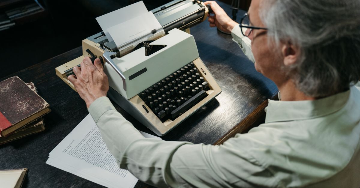
Prep a Clean Manuscript for Your Book Designer
LaunchPad Books Editorial ·
The short answer: mark structure, not style
To format your manuscript for a book designer, hand over a clean Word document that tells the designer what each piece of text is — a chapter title, a subheading, body copy, a block quote — and nothing about how it should look. The look is the designer's job, built later in professional layout software. Every decorative choice you make in Word gets stripped out before typesetting begins, so the time you spend prettying up your file is time you will pay someone to undo.
That single shift in thinking — structure over styling — is what separates a manuscript that flows smoothly into a beautiful book from one that racks up cleanup fees and revision rounds. Here is how to get it right.
Why your Word design gets thrown away
Picture the flourishy drop caps you imagined for your romantasy chapters, the gray sidebar boxes in your leadership book, the three header sizes you color-coded by level. When your files reach a book designer, all of it goes away. Poof. The designer rebuilds your interior inside a layout program — most often Adobe InDesign — where the real typography, spacing, and ornaments are crafted to a custom specification.
So the fonts, the centered epigraphs, the spaces you added around em dashes, the manual page numbering — none of it survives. Worse, it actively gets in the way. Manual page breaks, stray formatting, and inconsistent spacing have to be hunted down and removed before your text can flow into the design framework. That cleanup is billable, and an over-decorated manuscript almost always costs more, purely for the hassle of stripping it back to clean text.
The manuscript is not the place for design. It is the place for clean, consistent structure that a designer can pour into a layout without first having to take a chisel to your formatting.
Formatting versus design: the distinction that saves you money
These two words get used interchangeably, and that confusion is exactly what creates messy files. They are not the same thing.
Formatting communicates structure. It tells the designer that this line is a chapter heading, that one is a subheading, this paragraph is body text, and that indented block is a quotation. You signal structure using Word's built-in styles — not by eyeballing a bigger font and bolding it.
Design is the visual outcome — the typeface, the point size, the leading, the margins, the drop caps and dingbats. Those are decisions you and your designer make together up front when planning the look of the pages, and they get executed at the typesetting stage, not in your draft.
When you respect that boundary, your Word document drops into the designer's software cleanly and the designer spends their hours on craft instead of janitorial work.
The clean manuscript checklist
Consistency is the single most important quality of a production-ready manuscript. Whatever convention you choose, apply it identically from the first page to the last. Always confirm specifics with your own designer, but these guidelines hold across nearly every project.
- Use Word styles for everything structural. Apply Heading 1 for chapter titles, Heading 2 and Heading 3 for subheads, and a single Normal or Body style for paragraphs. Do not fake a heading by enlarging and bolding text by hand — the designer cannot reliably detect it.
- Pick one font and one size for the whole document. Something plain like 12-point Times New Roman or Calibri is ideal. The visible typeface in your draft is irrelevant to the printed book.
- Let paragraphs and chapters break naturally. Do not press Enter repeatedly to push a chapter onto a new page, and do not hand-adjust line spacing to fight widows and orphans. The designer controls all of that in layout.
- Use a single space after periods, and do not add spaces around em dashes to make them look better. Those tweaks have to be stripped out.
- Remove tracked changes and marginal comments. The final file should not carry lingering editorial questions between you and your editor. Accept or resolve everything first — settling those is part of a professional manuscript editing pass before the file moves to design.
- Skip manual page numbers, headers, and footers. Running heads and folios are generated by the layout software.
- Mark special elements as text, not pictures. Identify epigraphs, pull quotes, and block quotes with the appropriate Word style so the designer knows what to treat differently.
What most guides get wrong about decisions made before page one
Most formatting advice stops at the Word file. The more valuable insight is that the choices shaping your interior happen before a designer touches a single page — and authors are routinely left out of that conversation to their own cost.
The designer's real starting point is a set of physical decisions: the trim size (6 x 9, 5.5 x 8.5, or something else), the binding type (paperback, hardcover, or jacketed hardcover), and which versions you need — print, ebook, audiobook, or all three. These are not afterthoughts. They cascade through every later choice.
Trim size, for instance, is partly a function of length. Specify too large a page for a short book and the spine can end up too narrow to print text on; a designer might then widen the margins to bulk up a slim book to a respectable thickness. These are tricks of the trade, but they only work when the designer understands your goals — your genre, your comparable titles, and reader expectations in your category. Sort out format and binding early, because they steer both cover design and interior layout, and they directly affect your print-on-demand and book printing costs.
Handling images, tables, and graphics the right way
Embedding photos directly into a Word file is one of the most common — and most expensive — mistakes. Print-resolution images are large, they bloat the document, and they almost never land where they need to in the final layout.
Instead, mark placement in the text with a clear bracketed callout that includes the file name, a caption, and alt text if you are producing an EPUB. For example: [photo35.jpg: My sister (left) and I hiked the Grand Canyon in 2016]. Then deliver the actual high-resolution files as separate items in a folder, named or numbered to match each in-text callout exactly. Because these files are big, send them through Dropbox, Google Drive, or another transfer service rather than cramming them into the manuscript. This same discipline keeps your ebook conversion clean, since EPUB handles images as separate assets too.
Clean prep versus over-formatted prep, at a glance
| Element | What slows the designer down | What to do instead |
|---|---|---|
| Headings | Manually enlarged, bolded, or colored text | Apply Word Heading 1, 2, and 3 styles |
| Chapter breaks | Rows of pressed Enter keys | Let the layout software start each chapter |
| Fonts | Multiple decorative typefaces and sizes | One plain font at one size throughout |
| Images | High-res photos embedded in the document | Bracketed callouts plus separate image files |
| Editorial notes | Tracked changes and margin comments left in | Resolve everything before delivery |
| Page furniture | Manual page numbers, headers, footers | Leave folios and running heads to the designer |
Ask one question that changes everything
Before you deliver anything, ask your designer a single question: what can I do to make your work easier, more efficient, and more accurate so you can focus on design rather than cleanup? Their answer — preferred styles, file-naming conventions, how they want block quotes flagged — becomes your spec. A ten-minute conversation up front routinely saves a full revision round on the back end.
This is also why working with a coordinated team beats stitching together strangers. When your editor, designer, and production manager share conventions, your clean Word file moves through self-publishing production with far fewer handoff errors. At LaunchPad Books we keep authors inside that loop while they keep every right and every royalty — so the people preparing your book are aligned, and you are never guessing what the next person needs.
Stop formatting. Start your book the right way.
A clean manuscript is the cheapest insurance you can buy in publishing: it protects your budget, your timeline, and your designer's sanity. Mark structure, drop the styling, sort your trim and binding early, and deliver images the smart way — and your book flows straight into a professional layout instead of a cleanup queue.
If you would rather hand the whole production puzzle to people who do this every day, our team can take your finished manuscript through editing, design, print, and ebook without you losing a single right or royalty. Get started with a free consultation or see transparent pricing, and let us turn your clean Word file into a book readers want to hold. Stop playing art director — and just write the darn book.
Source: Jane Friedman
Ready to publish your book?
Talk to a real publishing advisor — free, no pressure.
Frequently asked questions
Should I design my manuscript in Word before sending it to a designer?
No. Any fonts, colors, drop caps, boxes, or decorative spacing you add in Word get stripped out during typesetting. Your job is to mark structure — what is a heading, body paragraph, or block quote — using Word styles. The designer builds the actual look in software like InDesign, so decorative work in Word only adds cleanup time and cost.
What is the difference between formatting and design in a manuscript?
Formatting tells the designer the structure of your text — which lines are headings, subheadings, body, captions, or block quotes. Design is the visual treatment — fonts, sizes, spacing, and ornaments. Authors should handle formatting through consistent Word styles and leave all design decisions to the typesetting stage.
How do I send images to my book designer?
Place a bracketed callout in the manuscript text where each image belongs, including the file name, caption, and alt text for EPUB, such as [photo35.jpg: My sister and I at the Grand Canyon]. Then deliver the actual high-resolution files separately in a folder, named to match each callout, via Dropbox or Google Drive since print images are too large to embed.
Why does an overly formatted manuscript cost more?
A designer has to undo every manual page break, stray font change, double space, and decorative element before the file can flow into the layout. That cleanup is billable time. A clean, consistently styled manuscript flows straight into the design framework, so you pay for design rather than for fixing avoidable mess.