Publishing News
Manuscript Formatting for Self-Publishing: Do Less
LaunchPad Books Editorial ·
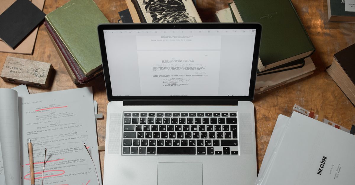
Stop formatting your manuscript. That is the single most useful thing most self-publishing authors can hear before they send a book to design — all the careful fonts, drop caps, gray boxes, and centered epigraphs you lovingly added in Word get stripped out the moment your file lands in a designer's software.
Manuscript formatting for self-publishing is about structure, not looks. Your job is to hand over a clean, consistent file that flows into a designer's layout program without a fight. Their job is to make it beautiful. Confuse those two roles and you pay for it — in time, in errors, and often in a higher production quote.
Here is exactly what to do, and what to leave alone.
Why your pretty Word file works against you
When you bold a heading, bump it to 18 point, switch to a script font for chapter openers, or nudge line spacing because you read that widows and orphans are bad, you are making design decisions inside a text document. Designers typeset books in software like Adobe InDesign, and a clean manuscript pours into that framework cleanly. A heavily decorated one has to be unpicked first.
That cleanup is not free. An over-formatted manuscript usually costs more to produce, purely for the hassle of stripping out everything you added. So before you touch a single style, ask your designer one question: what can I do to make your work easier and more accurate, so you can focus on design instead of cleanup? Most will happily send you a short list of preferences. Honoring it is the cheapest way to lower your bill.
The manuscript is not the place for your aesthetic. Every font choice, drop cap, and dingbat you add gets removed during typesetting — so the time you spent on it is time you paid for twice.
Format for structure: use styles, not looks
Format, in a production sense, does not mean appearance. It means telling the designer what each line is: a chapter title, a subheading, body text, a caption, a block quote. You communicate that with Word's built-in styles, not with manual font changes.
This matters because styles carry structure through to the layout software. If you mark every chapter title with the Heading 1 style, the designer can apply one custom chapter design to all of them at once. If instead you just made each title big and bold by hand, the software sees ordinary text, and someone has to fix every chapter manually.
A few rules that hold true across almost every designer's workflow:
- One font, one size. Set the whole manuscript in a single readable font such as Times New Roman or Garamond at 12 point. Do not change fonts or colors to signal hierarchy.
- Mark hierarchy with heading styles. Use Heading 1 for chapter titles, Heading 2 for subheads, and so on — consistently, every time.
- Let the software break pages. Never press Enter repeatedly to push a chapter onto a new page. Use a single page break, or better, let the designer handle chapter openings entirely.
- Stop fixing spacing. No double spaces after periods, no manual spaces around em dashes, no hand-tuned line spacing. The designer resets all of it.
- Strip the extras. Remove page numbers, headers, footers, highlighted sidebars, and colored text. These are layout decisions, not manuscript content.
The golden rule underneath all of this is consistency. Whatever convention you choose, apply it identically from page one to the end. A consistent file — even an imperfect one — is far easier to design than a creative one.
Clean the file before it leaves your hands
A surprising amount of designer frustration comes not from formatting but from leftover editorial debris. Your final manuscript should read like a finished decision, not an open conversation.
Two habits make the biggest difference:
- Accept or remove all tracked changes and comments. Your designer is not there to adjudicate a lingering question between you and your editor. Resolve every edit and delete every margin note before handoff. If you are still wrestling with the words themselves, that is a sign the manuscript needs another pass with a professional editing service before it ever reaches design.
- Handle images by reference, not by embedding. Do not paste pictures into the Word file. Instead, drop a bracketed callout exactly where each image belongs, like this: [photo 35.jpg: my sister and I hiked the Grand Canyon in 2016]. Include the caption and, for an EPUB, the alt text right there.
Then deliver the real images as separate high-resolution files in a clearly named folder, with file names that match your in-text callouts. Print-quality images are large, so send them through Dropbox, Google Drive, or another transfer tool rather than trying to email them. This keeps your text file light and gives the designer print-ready assets in one move.
Decide the big things before design, not during
Clean files are only half the picture. The other half is direction. Before a designer can lay out a single page, a few foundational choices shape everything that follows — and they are decisions you should make deliberately, ideally while planning your self-publishing path rather than at the last minute.
| Decision | Common options | Why it matters |
|---|---|---|
| Trim size | 5.5 x 8.5, 6 x 9, or larger | Drives page count, margins, and how the book sits against comparable titles on a shelf |
| Cover type | Softcover, hardcover, jacketed | Changes spine, layout, and production cost |
| Formats | Paperback, hardcover, ebook, audiobook | Each format has its own layout and file requirements |
| Page count vs. size | Bulk a short book with wider margins | A spine too narrow for text forces a redesign |
These are not cosmetic preferences. Trim size and length interact in ways most first-time authors do not expect — pick too large a size for a short book and the spine can end up too thin to print the title legibly. Experienced designers know the tricks, such as adjusting margins to bulk a slim book to a respectable thickness, but they need to understand your goals to apply them. Talk through trim size, binding, and formats up front, and align those choices with how you intend to handle book printing and print-on-demand distribution.
What most formatting guides get wrong
Plenty of advice tells authors to make their manuscript look as close to a finished book as possible. That is backwards. The closer your Word file looks to a typeset book, the more hidden formatting a designer has to dismantle to rebuild it properly. A manuscript that looks plain but is structured cleanly is worth far more than one that looks polished but is a tangle of manual overrides.
There is also a quiet trap in tools like Vellum and Atticus. They produce genuinely attractive output, and for a fully DIY author publishing straight to a retailer, that can be enough. But if you plan to work with a professional designer for a custom interior — or you want print and ebook editions that match a distinct visual identity, including a striking cover design — the file you export still needs to respect the same structural discipline. Beautiful output is not the same as a clean handoff.
The reward for restraint is real: a designer who spends their hours designing your book instead of cleaning it. That means fewer rounds, fewer introduced errors, and a lower quote. The less you decorate, the more you get.
Ready to hand off a clean manuscript?
You write the book; the right team makes it look like one — and the cleaner your file, the better and faster that happens. LaunchPad Books helps authors publish, print, and promote their work while keeping every right and every royalty, so the polish never costs you ownership. If you want a production partner who turns a tidy Word file into a professionally designed paperback, hardcover, and ebook, get started with a free consultation and we will map out the trim size, formats, and design direction that fit your book — before a single page is laid out.
Source: Jane Friedman
Ready to publish your book?
Talk to a real publishing advisor — free, no pressure.
Frequently asked questions
Do I need to design my manuscript before sending it to a book designer?
No. Your manuscript should be formatted for structure, not appearance. Use Word styles to mark what is a chapter heading, subheading, body text, or block quote, then let the designer choose fonts, drop caps, spacing, and page layout in their software. Decorative formatting you add gets stripped out anyway, and an over-designed file usually costs more to clean up.
What font and spacing should I use for a self-publishing manuscript?
Use one standard, readable font throughout, such as Times New Roman or Garamond at 12 point, with consistent line spacing. Do not change fonts, sizes, or colors to signal headings — apply Word heading styles instead. Avoid double spaces after periods and manual line breaks, since the designer reformats all of this during typesetting.
How do I mark images and photos in my manuscript?
Insert a bracketed text callout where each image belongs, such as [photo 35.jpg: my sister and I at the Grand Canyon, 2016]. Then deliver the actual high-resolution image files separately in a folder, named to match the in-text callouts. Print images are large, so send them through Dropbox, Google Drive, or another transfer tool rather than embedding them.
Will formatting my manuscript myself save money?
Usually the opposite. Heavy formatting, custom fonts, manual spacing, and leftover tracked changes create cleanup work that many designers bill for. A clean, consistently styled Word file flows straight into design software and keeps your production quote lower, because the designer spends time designing rather than undoing your formatting.