Publishing News
How to Prepare a Manuscript for Your Book Designer
LaunchPad Books Editorial ·

What your book designer actually needs from your manuscript
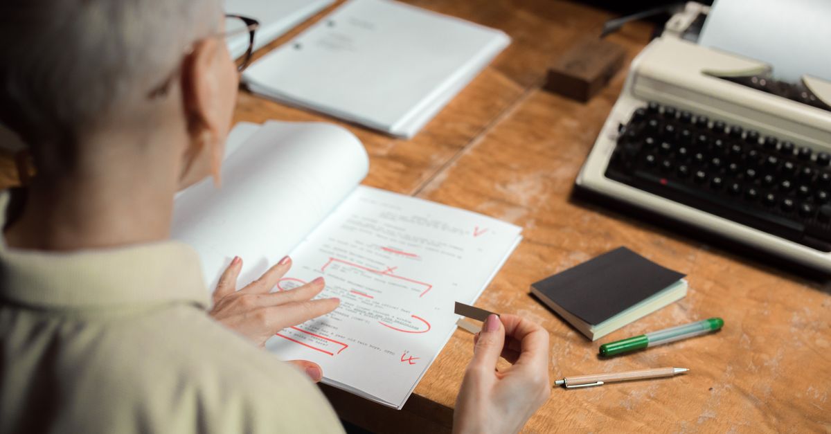
Your book designer needs one thing above all else: a clean, consistently structured Word document with the decorative styling stripped out. Not a pretty file—a clean one. The flourishy drop caps, the gray callout boxes, the hand-centered epigraphs, the spaces you tucked around every em dash—all of it gets deleted the moment your file flows into professional layout software. Worse, it slows the designer down and can quietly inflate your invoice.
If you take nothing else from this guide, take this: the manuscript is not the place for design. It is the place for structure. Your job is to tell the designer what each piece of text is—a chapter title, a subheading, body text, a block quote—not what it should look like. The look is a decision you and your designer make together, and it lives in their software, not your Word file.
Why all your formatting gets stripped out anyway
Most professional interiors are typeset in Adobe InDesign. When your Word document is imported, the designer maps your paragraph styles to their own carefully built layout—type sizes, leading, margins, running heads, and the rest. Anything you applied manually either gets overridden or has to be removed by hand first.
So the centered pull quote you spent ten minutes nudging into place? Overwritten. The two different fonts you used for your H1 and H2? Gone. The page numbers you added? Replaced by the designer's master pages. The satisfaction you felt looking at your formatted pages in Word, Vellum, or Atticus does not survive the handoff—and the cleanup it creates is billable time you would rather spend on the actual cover and interior design.
The single most valuable question you can ask before handing off your files is simple: what can I do to make your work easier, faster, and more accurate so you can focus on design instead of cleanup? Most designers will happily send you a one-page spec, and following it can shave real money off your quote.
Structure, not style: use Word paragraph styles
Here is the part most authors miss. Word already has a built-in system for marking structure: paragraph styles. Open the Styles pane and you will see Heading 1, Heading 2, Normal, Quote, and more. Instead of selecting your chapter title and bumping the font to 24pt bold, you simply apply the Heading 1 style. Instead of indenting and italicizing a long quotation by hand, you apply the Quote style.
Why this matters: styles travel into InDesign as named tags. When every chapter title is tagged Heading 1, the designer can format all of them in one click and trust that none were missed. When you format by eye, there is no way for the software to know a line is a chapter title versus a line you happened to make big and bold—so a human has to check every one. Consistency is the whole game. Whatever convention you choose, apply it the same way throughout the entire manuscript.
The clean-manuscript checklist
- Finish editing first. Your manuscript should be fully written and edited before it reaches a designer. If you have not had a professional edit, sort that out with professional editing before typesetting—fixing text after layout is far more expensive.
- Accept all changes and delete comments. Do not leave tracked changes or marginal notes in the final file. The designer's job is not to resolve lingering questions between you and your editor.
- Use one body font, one size. Remove color, custom fonts, and varied sizes. Let the designer choose the typeface.
- Apply paragraph styles consistently. Mark headings, subheadings, body, captions, and block quotes with styles—not manual formatting.
- Kill manual spacing. No extra blank lines to push chapters to a new page, no double spaces, no spaces around em dashes, no manual page numbers.
- Mark image positions with brackets. Drop a callout where each image belongs and supply the real files separately.
Common mistakes and what to do instead
Most of the damage comes from a handful of well-meaning habits. Here is what to stop doing and what replaces it.
| Common manuscript mistake | Do this instead |
|---|---|
| Decorative fonts, colors, and drop caps | One plain body font; let the designer add decorative elements in layout |
| Pressing Enter repeatedly to start a new page | Use a single page break, or just start the new chapter with its Heading style |
| Centering epigraphs and pull quotes by hand | Apply a Quote or custom paragraph style and let the designer position it |
| Adding page numbers and running headers | Leave these out entirely—they are generated in layout |
| Pasting images directly into Word | Add a bracketed callout and deliver high-resolution files separately |
| Spaces on each side of em dashes | Use a clean em dash with no surrounding spaces |
Handling images, tables, and special elements
Images need extra care because the low-resolution copy you paste into Word is useless for print. In the text, mark the intended spot like this: [photo35.jpg: My sister and I hiked the Grand Canyon in 2016.] If you are also producing an ebook, include alt text in the callout so it carries into the EPUB. Then collect every high-resolution image, illustration, and graphic in a separate folder, named to match the in-text callouts, and send them through Dropbox or Google Drive—print-quality files are usually too large to email.
Tables and charts follow the same logic. Build them simply, flag anything complex, and tell the designer if a chart needs to be redrawn to match the book's look. If your book is heading toward both print and digital, decide early which versions you want—paperback, hardcover, ebook, and audiobook—because each one changes how assets need to be prepared.
Trim size and format come before any design
What most guides get wrong is treating manuscript prep as the first step. It is not. The real starting point is a set of decisions that shape everything downstream: the finished trim size, the cover type, and which editions you are producing. Get these right and the rest of the process is smooth.
| Decision | Why it matters |
|---|---|
| Trim size (6x9, 5.5x8.5, and so on) | Sets page count, margins, and spine width; the wrong size can leave too little spine for text |
| Cover type (soft, hard, jacketed) | Changes spine and case design and affects printing cost |
| Editions (paperback, hardcover, ebook, audiobook) | Each format needs different files and design treatment |
| Comparable titles | Bookstore and reader expectations guide size and style choices |
These are not afterthoughts. A short book set in a large trim looks padded; a long book in a small trim feels cramped. Designers know the tricks—wider margins to bulk up a slim book, tighter leading to control page count—but they need to understand your goals first. This is where a real conversation with your cover and interior designer pays off, and where mapping out your print specifications early prevents costly do-overs.
A handoff workflow that saves everyone time
Put it together and the workflow is straightforward. Lock your trim size and editions. Finish the edit. Strip the file down to clean, consistently styled text. Add image callouts and gather high-resolution assets in a named folder. Then ask your designer for their preferences before you send anything, because every studio has small quirks worth honoring.
Do this and you protect the two things authors care about most: your timeline and your budget. A clean manuscript means the designer spends their hours making your book beautiful instead of cleaning up after it—and when you self-publish smartly, you keep both control and your royalties. At LaunchPad Books we help authors publish, print, and promote while keeping every right and every royalty, so the work you put into a clean handoff goes straight into a better book.
Ready to turn your finished manuscript into a professionally designed book? Explore your options for stress-free self-publishing, or get started with a free consultation and let our team handle the layout, cover, and production while you focus on what you do best—writing the darn book.
Source: Jane Friedman
Ready to publish your book?
Talk to a real publishing advisor — free, no pressure.
Frequently asked questions
What format should I send my manuscript to a book designer in?
Send a single Microsoft Word file (.docx) unless your designer requests otherwise. Word flows cleanly into professional layout software like Adobe InDesign. Avoid sending PDFs, Google Docs exports with messy code, or already-typeset Vellum or Atticus files as your source, since those create extra cleanup.
Should I format my manuscript to look like a finished book?
No. Decorative fonts, drop caps, gray boxes, centered epigraphs, and manual page numbers all get stripped out during typesetting. Instead of styling for looks, use Word paragraph styles to mark structure—heading, body text, block quote—so the designer knows what each element is.
How do I tell a designer where images go?
Place a bracketed callout in the text at the spot the image belongs, like [figure3.jpg: caption text here], and add alt text if you are producing an EPUB. Deliver the actual high-resolution image files separately in a folder, named to match each callout, via Dropbox or Google Drive.
Will a clean manuscript actually save me money?
Yes. An overly designed or inconsistent file forces the designer to spend billable hours undoing your formatting before real design begins. A clean, consistently styled manuscript lets them focus on layout, which usually means a faster turnaround and a lower quote.