Publishing News
How to Prepare a Manuscript for a Book Designer
LaunchPad Books Editorial ·
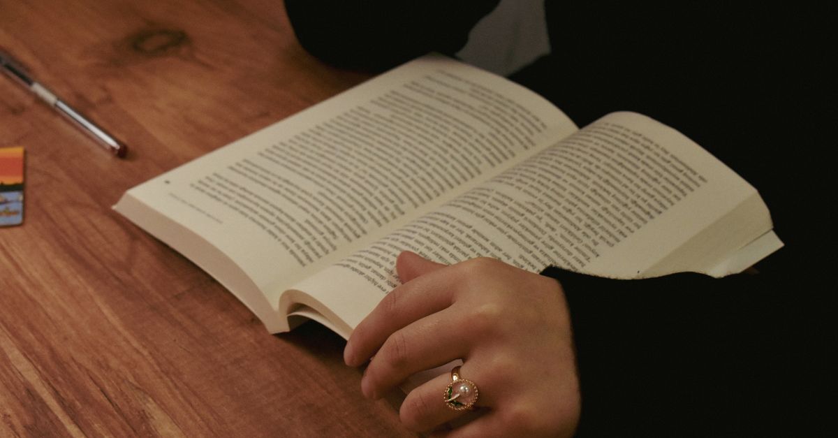
The single best thing you can do is stop decorating your manuscript
If you want to prepare a manuscript for a book designer the right way, send a clean Word document that marks structure with paragraph styles and contains zero decorative formatting. That is the whole secret. The drop caps you dreamed up, the gray sidebars, the special dingbats, the em dashes with a space on each side — all of it gets stripped out before your designer lays a single page. Every hour spent removing your formatting is an hour not spent making your book beautiful, and on most projects you are the one paying for that hour.
This trips up more authors than almost anything else in production. You finally finish the writing, you feel the urge to make the pages look like a real book, and you start playing art director inside Word. Resist it. The manuscript is not the place for design. It is the place for words and for clear signals about what those words are.
Consistency is the most important feature of a clean manuscript. Whatever you do to preformat, do it the same way every single time — a heading is always a heading, body text is always body text.
Format is not design — and the difference is everything
Here is the distinction that changes how you work. Design is what an element looks like: the font, the size, the color, the spacing. Format, in a manuscript, simply tells the designer what an element is: this line is a chapter title, this is a subheading, this is body text, this is a block quote, this is a caption.
Your job is to communicate structure. The designer's job is to decide appearance. When you confuse the two and bake your aesthetic preferences into the file, you are not helping — you are handing the designer a puzzle to undo before they can begin. The look of your pages is a decision you and your designer make together, deliberately, usually inside professional layout software like Adobe InDesign. A clean, well-structured Word file flows straight into that framework. A fussed-over one fights it.
Use Word's paragraph styles — this is the professional move
The mechanism for marking structure already lives in Word: the Styles panel. Instead of selecting a chapter title and manually making it 18pt bold centered, apply the Heading 1 style. Apply Heading 2 to subheads, Normal or Body Text to your paragraphs, and the built-in Quote style to extracts. Now every chapter title carries the same invisible label, and your designer can restyle all of them in one action.
This single habit separates manuscripts that designers love from manuscripts that make them sigh. It costs you nothing, it makes your document easier to navigate while you write, and it is the backbone of clean ebook formatting too, since EPUB files are built on exactly this kind of structural markup.
Settle the big decisions before design starts
Before a designer can do anything, a few foundational choices have to be made, and they shape every option that follows. The most important is trim size — the finished dimensions of the page. A 6 x 9 inch nonfiction book and a 5.5 x 8.5 inch novel are different worlds, and the right pick depends on your genre, comparable titles, bookstore and reader expectations, and your word count.
These are not cosmetic choices. Trim size interacts with length in ways that surprise first-time authors. Specify too large a page for a short book and the spine can end up too narrow to print text on; designers will sometimes widen the margins to bulk up a slim book so it earns a readable spine. The other early decisions — cover type (softcover, hardcover, or jacketed) and which formats you are producing (paperback, hardcover, ebook, audiobook) — all branch from here.
Bring these answers, or at least your goals, to your designer early. If you are still weighing them, a good print-on-demand setup or a book printing partner can tell you what is physically possible before you commit to a layout.
| Element | What most authors do (wrong) | What the designer actually wants |
|---|---|---|
| Headings | Manually sized, colored, centered fonts | Word Heading 1 / Heading 2 styles applied consistently |
| Chapter breaks | Many Enter keystrokes to push to a new page | A single page break, or just a clear heading the designer handles |
| Emphasis | Bold, underline, color, ALL CAPS mixed freely | Italics for emphasis and titles; bold sparingly |
| Block quotes / epigraphs | Manual indents and centering | The Quote paragraph style |
| Images | Pasted into the Word file at low resolution | Bracketed text callouts plus separate high-res files |
| Spacing | Double returns, manual line spacing, tab indents | One return per paragraph; let styles control spacing |
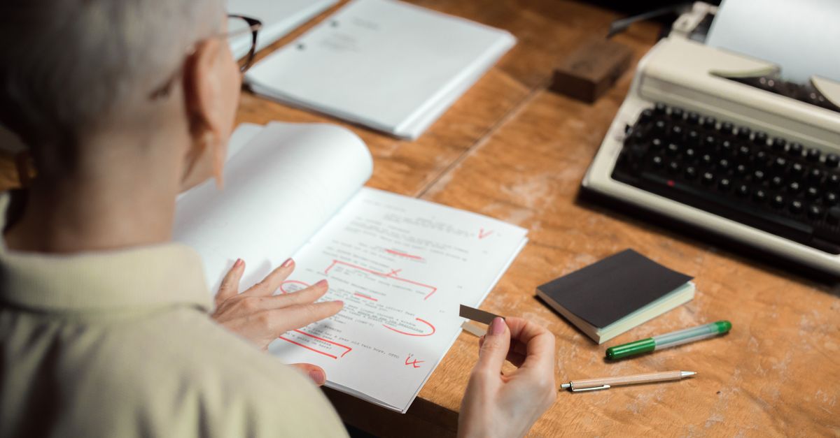
The cleanup checklist designers wish you knew
Before you hand anything over, walk this list. It is the difference between a smooth handoff and a frustrating, expensive one.
- Turn off Track Changes and accept or reject everything. Your designer is not there to settle lingering editorial questions between you and your editor. Resolve them first.
- Delete all comments and margin notes. Same reason — they are noise that has to be cleared before work begins.
- Remove manual page breaks made with Enter keys. Pressing Enter twenty times to start a new chapter creates chaos in layout software. Use one proper page break, or let the designer manage chapter openings.
- Strip decorative fonts, colors, and sizes. Drop caps, flourishy display fonts, gray boxes, special dingbats — none of it survives, so do not add it.
- Fix em dashes. Use a true em dash with no spaces around it, applied the same way throughout. Do not add spaces because they looked nicer on your screen.
- Remove page numbers, headers, and footers. The designer generates these as part of the layout.
- Use one space after periods, not two. Then run a find-and-replace to confirm it is consistent.
- Keep one file. Deliver the whole manuscript as a single Word document unless your designer asks otherwise.
Handling images and graphics the right way
Images need their own workflow. Inside the manuscript, mark each placement with a bracketed callout exactly where the image should sit, including the file name, the caption, and — for EPUB — the alt text. Something like: [photo 35.jpg: My sister (left) and I hiked the Grand Canyon in 2016.]
Then deliver the real images as separate, high-resolution files in a clearly named folder, with file names that match your in-text callouts. Print images are large, so move them through Dropbox, Google Drive, or another transfer service rather than email. Low-resolution images pulled from the web will look fine on screen and fall apart in print, so source the highest quality you can. If your interior art or charts need polishing, that is a conversation for your designer or a dedicated cover and interior design service, not something to wrestle with in Word.
What most guides get wrong about manuscript prep
The advice you usually hear stops at “send a clean file.” The deeper truth is that the cleanest possible manuscript is one where you asked your designer a single question first: what can I do to make your work easier, faster, and more accurate? Designers have personal preferences — some want specific styles named a certain way, some want chapter breaks marked a particular way, some want a style sheet attached. Ten minutes of asking up front saves both of you hours later and almost always lowers your bill.
The other thing guides miss: tools like Vellum and Atticus are wonderful for authors who are self-formatting an ebook or a simple paperback themselves, but if you are handing off to a human designer for a custom layout, the polished output those tools create is not what the designer needs. They need clean structure, not a finished-looking file to reverse-engineer. Know which path you are on before you start. If you want full control while still getting expert help, a guided self-publishing process can keep you in the driver's seat without the formatting headaches.
Hand off clean, publish faster
A well-prepared manuscript is one of the few places where doing less produces a better book. Mark your structure, strip your decoration, resolve your edits, organize your images, and ask your designer what they prefer — and you will get back pages that look professionally made, on a faster timeline, for less money.
If you would rather have a team handle the formatting, design, printing, and promotion while you keep every right and every royalty, LaunchPad Books can take your clean manuscript and turn it into a finished book. Start with a free consultation through our get started page, explore done-for-you editing and design, or request a quote on pricing — and spend your energy where it belongs, on writing the next one.
Source: Jane Friedman
Ready to publish your book?
Talk to a real publishing advisor — free, no pressure.
Frequently asked questions
Should I format my manuscript before sending it to a designer?
You should structure it, not decorate it. Use Word paragraph styles to label what each element is — Heading 1, Body Text, Block Quote — so the designer can map your structure to their layout. Avoid decorative fonts, colored text, custom spacing, and manual page breaks, because the designer strips all of that out anyway.
What file format do book designers want?
Most book designers want a single Microsoft Word document (.docx) with styles applied consistently. Word flows cleanly into professional layout software like Adobe InDesign. Send images and graphics separately as high-resolution files rather than pasting them into the document.
Why does over-formatting my manuscript cost more?
Decorative formatting, manual spacing, and inconsistent styling have to be removed before typesetting can begin. That cleanup is billable time. A messy file can add hours of prep, and many designers charge extra for files that need heavy untangling before the real design work starts.
How do I tell the designer where images go?
Place a bracketed callout in the text exactly where the image belongs, like [photo 35.jpg: caption text here]. Then deliver the actual high-resolution files in a separate folder, named to match each callout, shared through Dropbox or Google Drive since print images are usually too large to email.