Publishing News
How to Prepare a Manuscript for a Book Designer
LaunchPad Books Editorial ·

The cleaner your file, the cheaper and faster your book gets designed
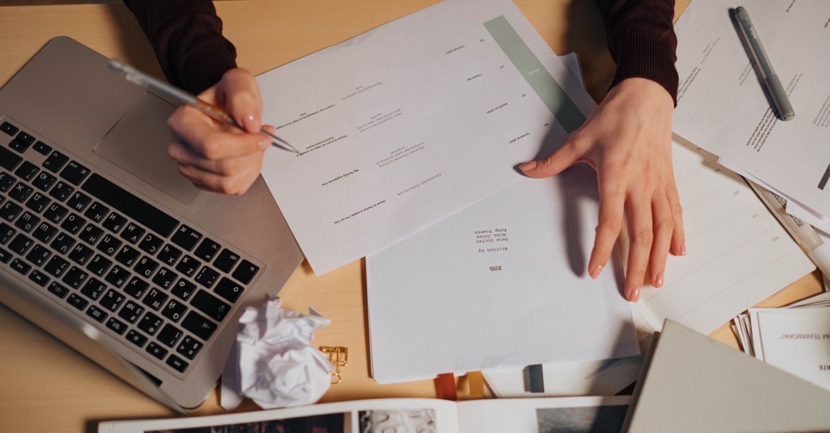
If you want your book to look professional and your design quote to stay low, hand your designer a clean Word document that marks structure with styles and contains zero decorative formatting. That is the whole secret. The manuscript is not the place for your aesthetic preferences, and almost every flourish you add in Word gets stripped out the moment your file lands in your designer software.
This trips up first-time authors constantly. You finished the book, you are proud of it, and you start dressing it up: a swirly font for chapter titles, gray sidebars for your business tips, em dashes with a space on each side because they look nicer. Then you send it off, and your designer quietly deletes all of it before the real work even starts. Worse, that cleanup shows up on your invoice.
Here is exactly how to prepare a manuscript for a book designer so your text flows straight into layout, your designer focuses on design instead of janitorial work, and you keep your money for things that actually move books.
Format is structure, not decoration
The single idea that fixes most manuscripts: format tells the designer what each line is, not what it should look like. A heading is a heading because you tagged it as one, not because you made it 18-point bold and centered.
Designers build a book in software such as Adobe InDesign. They create a custom layout where every structural element has a defined look: chapter titles, subheads, body text, captions, block quotes, and so on. When your Word file uses real paragraph styles, those tagged elements pour into the InDesign framework and instantly take on the designed look. When your file uses fake formatting instead, the designer cannot tell a subhead from a styled paragraph, so they have to hunt through the whole book by eye and fix it manually.
So your job is to label, not to beautify. Use Word built-in paragraph styles (Heading 1, Heading 2, a Block Quote style, and so on) and apply them consistently from page one to the last page. Consistency is the most important feature of a clean manuscript: whatever convention you choose, use it the same way throughout.
If you remember one thing, remember this: tag what a line is, never how it should look. The look is a decision you and your designer make together, on purpose, in the layout — not something you guess at in Word.
What most authors get wrong
The mistake is not adding too little polish — it is adding the wrong kind. Authors assume a pretty manuscript signals professionalism. To a designer, it signals hours of removal work. Here is what gets stripped out and what to do instead.
| What authors add in Word | What actually happens | What to do instead |
|---|---|---|
| Decorative fonts, drop caps, colored headers | Stripped out; flagged as cleanup | Apply a Heading style and let the designer choose the look |
| Manual page breaks (many Enter presses) to start chapters | Creates stray blank lines in layout | Use one page break or a chapter Heading style |
| Spaces on both sides of em dashes | Inconsistent spacing the designer must find and remove | Use a clean em dash with no extra spaces |
| Gray boxes, sidebars, dingbats | Do not survive import; must be rebuilt | Mark the text with a style and describe the intent |
| Page numbers, headers, footers | Ignored; the layout generates its own | Leave them out entirely |
| Images pasted into the document | Low resolution, unusable for print | Use a bracketed callout plus separate high-res files |
Decide the big production choices first
Before anyone touches layout, the designer needs to know the physical book you are building, because those choices change every design option. The usual starting questions are the finished trim size (6 x 9, 5.5 x 8.5, or something else), the cover type (softcover, hardcover, or jacketed), and which versions you need (paperback, hardcover, ebook, audiobook).
These are real decisions, not afterthoughts. Trim size is driven by comparable titles in your genre, bookstore and reader expectations, and your page count. Specify too large a trim for a short book and the spine can end up too narrow to print text on; a designer might widen the margins to bulk out a thin book instead. This is exactly the kind of trade-off where experience pays off, and where a team that handles print-on-demand production and book printing can steer you toward a format that prints well and looks right on the shelf. If you are weighing formats, our overview of self-publishing options walks through how trim, cover, and edition choices fit together.
Your pre-handoff checklist
When your manuscript is edited and ready, run through these before you send the file. They map directly to what designers ask for.
- Accept or remove all tracked changes and delete marginal comments. The designer is not there to resolve open questions between you and your editor. A final file should be final.
- Use one consistent paragraph style per structural element. Body text in one style, chapter titles in another, subheads in another. Do not mix.
- Remove manual page numbers, running headers, and footers. The layout produces these automatically.
- Strip decorative formatting. No special fonts, font colors, drop caps, gray boxes, or dingbats. Describe the intent in a note if it matters.
- Clean up spacing. No double spaces after periods, no rows of empty paragraphs to force page breaks, no manual spacing around em dashes.
- Handle images by reference, not by pasting. In the text, place a callout like [photo 35.jpg: My sister (left) and I hiked the Grand Canyon in 2016.] including the caption and, for EPUB, alt text.
How to deliver images the right way
Pasted images are almost always too low-resolution for print, and they bloat your Word file. Instead, deliver the real graphics, photos, and illustrations as separate files in a clearly named folder, with file names that match your in-text callouts exactly. Print-quality image files are large, so send them through Dropbox, Google Drive, or another transfer service rather than email.
That matching system — [photo 35.jpg] in the text, photo 35.jpg in the folder — lets the designer drop each image into the right spot without guessing. If your book leans heavily on visuals, talk through resolution and placement early, the same way you would coordinate professional cover design so the interior and exterior feel like one cohesive package.
Ask the one question that saves you the most
Before you send anything, ask your designer directly: what can I do to make your work easier, faster, and more accurate so you can focus on design instead of cleanup? Every designer has small preferences, and a five-minute conversation up front prevents a round of corrections later. Cleanup is billable; a clean handoff is not.
Getting the manuscript right is one piece of a larger production chain — editing, interior layout, cover, and the various editions all have to line up. If you would rather not juggle the handoffs yourself, the team at LaunchPad Books helps authors publish, print, and promote their books while keeping every right and every royalty, so you can stay focused on the writing. Explore professional editing to lock the text before layout, or see how the full process works on our get started page.
Ready to turn a clean manuscript into a finished book? Send us your edited Word file and tell us the book you want to build, and we will map out trim size, cover, and editions with you and give you a clear quote — no formatting cleanup surprises. Start your project on the get started page or browse our self-publishing services to see exactly where your manuscript goes next.
Source: Jane Friedman
Ready to publish your book?
Talk to a real publishing advisor — free, no pressure.
Frequently asked questions
What format should I send my manuscript to a book designer in?
A single Microsoft Word (.docx) file is the standard. Designers import Word into layout software like Adobe InDesign, so a clean, consistently styled Word document flows in cleanly. Avoid PDFs for the editable manuscript, and supply images as separate high-resolution files.
Should I format my manuscript before sending it to a designer?
No. Use paragraph styles to mark structure (which line is a heading, body, or block quote) but do not add decorative fonts, drop caps, colored text, gray boxes, or manual page breaks. Visual design is the designer job, and your formatting gets stripped out anyway.
Why does an over-formatted manuscript cost more?
Every decorative font, manual space, and stray page number must be removed before layout begins. That cleanup is billable time. A clean, styled file lets the designer spend hours on design instead of undoing your formatting, which lowers your quote.
How do I include images in my manuscript for the designer?
Do not paste images into Word. Place a bracketed callout in the text such as [photo 35.jpg: caption here] and deliver the actual high-resolution files in a separate folder with file names that match the callouts, shared via Dropbox or Google Drive.