Publishing News
How to Prepare a Clean Manuscript for Your Book Designer
LaunchPad Books Editorial ·

The fastest way to lower your design bill is to stop designing
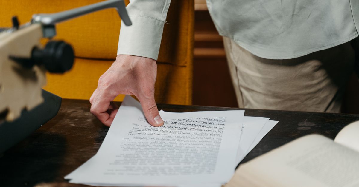
If you want a smooth, affordable hand-off to your book designer, send a structurally clean Word document with the editing finished, all tracked changes and comments removed, and Word styles used to mark what each line is rather than how you want it to look. That is the whole secret. The decorative work you did in Word — the drop caps, the colored headers, the hand-tuned spacing — almost all of it gets stripped out the moment your file lands in professional layout software.
This trips up first-time authors constantly, and it is an easy fix once you understand what is actually happening to your file. A designer does not open your Word document and admire it. They pour it into a tool like Adobe InDesign, where the real cover and interior design happens. Your job is to make that pour clean.
Format is structure, not decoration
Here is the distinction that changes everything: format tells the designer what a line is; design tells the reader what it looks like. Those are two different jobs, and only one of them is yours.
When you mark a line as Heading 1, you are not choosing a font — you are telling the designer this is a chapter title. When you mark a paragraph as Block Quote, you are flagging it as a pull-out, not picking its indent. The designer then maps each of those structural tags to a custom visual treatment built for your specific book. If you instead manually bold a chapter title, bump it to 18-point, center it, and add three blank lines above it, you have given the designer zero useful structure and a pile of formatting to undo.
Every decorative choice you make in Word is a choice your designer has to detect, interpret, and reverse before the real work begins — and that reversal is billable time that buys you nothing.
What actually gets thrown away
Authors are often shocked by how much of their careful Word styling simply vanishes. It helps to see it laid out, so you stop spending energy on things that evaporate.
| What you did in Word | What happens in design | What to do instead |
|---|---|---|
| Chose fancy fonts, drop caps, colored headers | Stripped and replaced with the custom design | Leave it plain; let the designer choose |
| Pressed Enter many times to start a new chapter | Deleted; creates spacing errors in layout | Use a page break or a Heading style |
| Added page numbers and running headers | Removed; layout software generates these | Do nothing — it is handled in design |
| Put spaces around em dashes, double spaces after periods | Has to be found and cleaned globally | Single space; no spaces around em dashes |
| Pasted images directly into the document | Low-resolution and unusable for print | Send high-res files separately (see below) |
Notice the pattern. Nearly everything in the first column is effort you spent that gets erased. The version of you that skips all of it ends up with a cleaner file, a faster turnaround, and a smaller invoice.
The five-minute prep checklist most guides skip
General advice tells you to send a clean file. Here is the part that gets glossed over: consistency matters more than correctness. A designer can adapt to almost any reasonable convention you choose, as long as you apply it the same way every single time. Inconsistency is what forces them to inspect your document line by line.
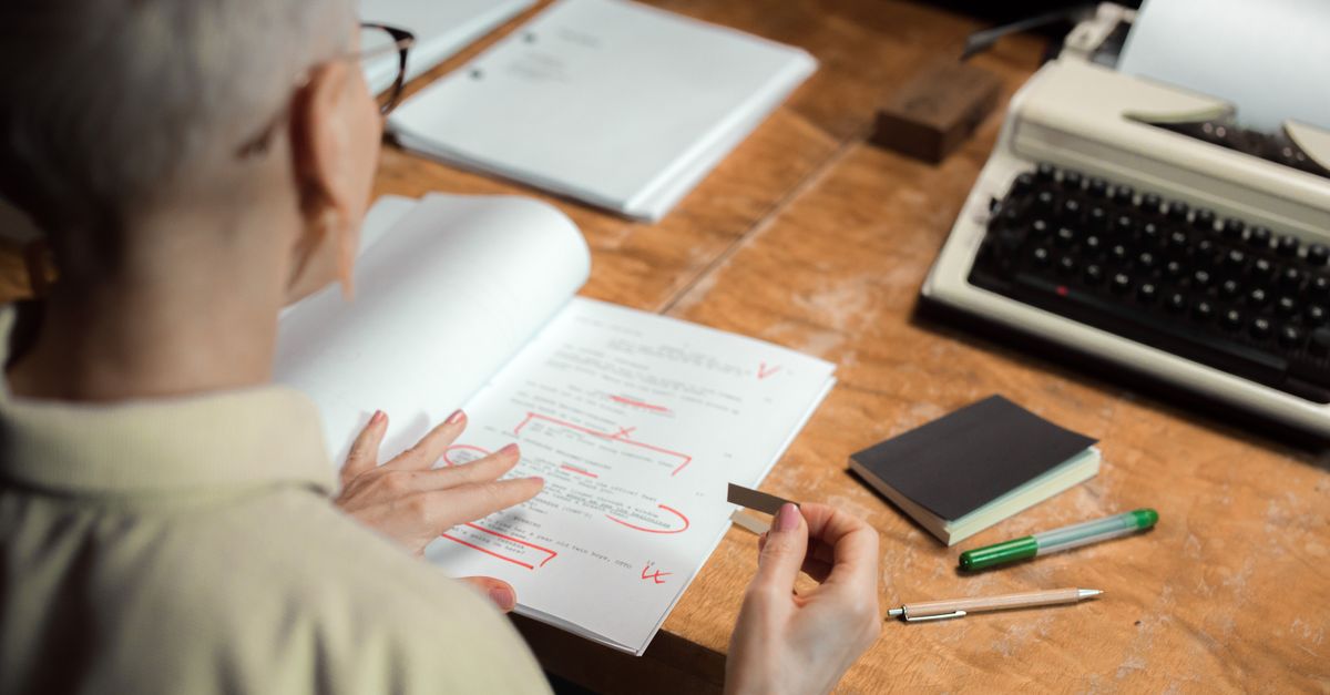
- Finish the edit first. Accept or reject all tracked changes and delete every comment and margin note. The designer should never have to wonder whether a line is final. If your manuscript still needs a pass, handle that during professional editing before design begins.
- Apply real Word styles. Use the built-in styles — Heading 1, Heading 2, Normal, Quote — to mark structure. Do not fake a heading by manually enlarging text. This single habit does more for your designer than anything else.
- Stop using Enter as a layout tool. One paragraph break between paragraphs. For a new chapter, use a page break or let the chapter-heading style do the work. Rows of blank lines become orphaned spacing in InDesign.
- Normalize your spacing and characters. Single space after periods, no spaces hugging em dashes, no manual hyphenation. Word can find-and-replace double spaces in seconds.
- Mark image placement with a callout, not the image. Inside the text, write a bracketed note where each image belongs, like [photo 35.jpg: My sister, on the left, and I hiked the canyon in 2016]. Then deliver the actual high-resolution files separately.
How to hand off images and illustrations
This is where print projects quietly go wrong. Images dropped into a Word document are compressed and far too low-resolution for print. Instead, gather every image, graphic, and illustration into a folder, name each file to match its in-text callout — photo-35.jpg lines up with the [photo 35.jpg] note — and send the folder through Dropbox, Google Drive, or another transfer service, since print-quality files are usually too large to email. Matching names mean the designer never has to guess where anything goes, which keeps your print production on schedule.
Decide the big specs before design, not during
One more thing that saves rounds of revision: settle the physical decisions early, because they reshape every design choice that follows. Before a designer can lay out a single page, they need to know the trim size (6 x 9 and 5.5 x 8.5 are common), the cover type (softcover, hardcover, or jacketed), and which formats you are producing — paperback, hardcover, ebook, audiobook, or some mix.
These are not afterthoughts. Trim size interacts with page count in ways that surprise authors. Specify too large a page for a short book and the spine can end up too narrow to even print text on. A skilled designer knows the tricks — widening margins to give a slim book more presence, for instance — but they need to know your goals to apply them. Sorting this out up front is part of a smart self-publishing plan, and it prevents the expensive scenario where a finished layout has to be rebuilt at a different size.
Why this matters more for indie authors
Traditionally published authors hand their manuscript to a house that absorbs all of this. When you publish independently, that coordination is yours — which is exactly why getting the hand-off right pays off directly in your own budget and timeline. A clean file is not busywork; it is the difference between a designer spending your money on cleanup versus spending it on a book that looks like it belongs on a shelf. LaunchPad Books exists to carry that load with you, helping authors publish, print, and promote their work while keeping every right and every royalty.
Ask your designer one question before you send anything: what can I do to make your work easier and more accurate, so you can focus on the design instead of the cleanup? That single question signals you understand the workflow, and it almost always shortens the project.
Hand off with confidence
You wrote the book — now let the right people make it look like one. If you want a clean, professional path from finished manuscript to printed book without guessing at trim sizes or wrestling with InDesign, our team can take it from here. Start a conversation about your project on our get started page, or explore print-on-demand and design services built for authors who want to keep control of their work. Send us a tidy file, and we will turn it into a book you are proud to hold.
Source: Jane Friedman
Ready to publish your book?
Talk to a real publishing advisor — free, no pressure.
Frequently asked questions
Should I format my manuscript before sending it to a book designer?
You should structure it, not decorate it. Apply Word styles so the designer knows what each line is — a chapter title, a subhead, body text, a block quote — but skip fonts, colors, drop caps, custom spacing, and page numbers. Almost all visual formatting gets stripped out when your file flows into design software, so adding it only creates cleanup work and can raise your bill.
What file format do book designers want for a manuscript?
A Microsoft Word document (.docx) is the standard hand-off. Designers import Word into layout tools like Adobe InDesign, and a clean Word file with proper styles flows in predictably. Send images and illustrations separately as high-resolution files rather than pasting them into the document.
Do I need to remove tracked changes before sending my manuscript?
Yes. Accept or reject all tracked changes and delete every comment and margin note before you hand off the file. The designer is not there to resolve open editorial questions, and leftover markup can carry hidden formatting into the layout. Send the final, settled text only.
Why does an over-formatted manuscript cost more?
Because someone has to undo it. Drop caps, colored headers, manual page breaks, double spaces, and special characters all have to be cleaned out before design begins, and that cleanup is billable time. A tidy, consistently styled file lets the designer spend the budget on the actual book design instead of repair work.