Publishing News
How to Format Your Manuscript for Book Design
LaunchPad Books Editorial ·

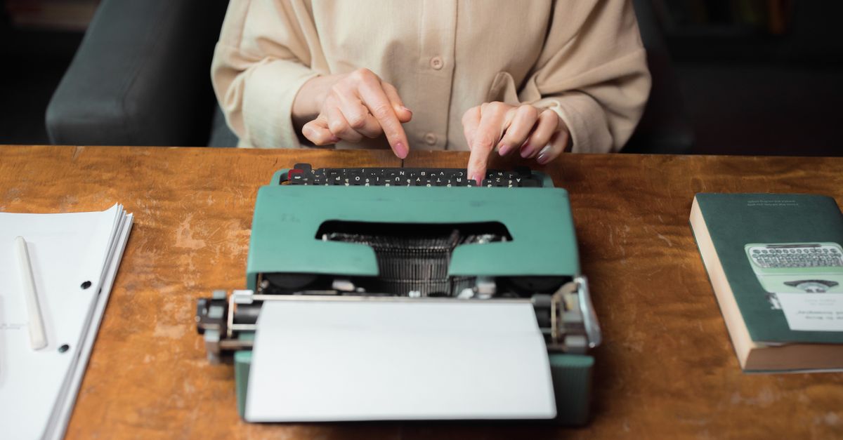
If you want to format a manuscript for book design the right way, the answer is almost the opposite of what feels productive: stop styling it. Hand your designer a clean Word file that marks structure — what each line is — and let the actual look of the pages happen later, in their layout software. Every fancy font, colored header, drop cap, and centered epigraph you add gets stripped out anyway, and an over-decorated file usually costs you more, not less.
That is the part most authors get wrong. They treat the manuscript like a design canvas. A professional designer treats it like raw material. The cleaner and more consistent that raw material is, the faster your book moves from finished draft to finished pages — and the more of your budget goes toward design instead of cleanup.
Why your beautiful Word file gets thrown away
Here is what happens after you send files off. Your designer imports your Word document into professional layout software — commonly Adobe InDesign — where they build a custom template: trim size, margins, running heads, chapter openers, the typeface for body and display, and the spacing system that holds it all together. When your file flows into that template, the software overrides your fonts, your sizes, your colors, and your manual spacing.
So the flourishy chapter font, the gray sidebar boxes, the three different header colors, the page numbers you added by hand — poof. Gone. Worse, leftover manual formatting can fight the template and create errors the designer has to hunt down and fix. That cleanup is billable time, or it is friction that slows the whole project.
The manuscript is not the place for design. It is the place to tell the designer what each element is, consistently, so their software can do the rest.
The single most valuable question you can ask before you hand anything over is this: what can I do to make your work easier, faster, and more accurate? Most designers will happily send you a short style sheet or a list of preferences. Two minutes of that conversation saves hours later.
Format means structure, not looks
This is the mental shift that fixes everything. Format tells the designer the role of each line — heading, subheading, body text, caption, block quote. It does not tell the designer what those lines should look like. That visual choice is made in advance, together, based on comparable books and reader expectations, then executed in the layout.
The tool that communicates structure is Word paragraph styles — the Heading 1, Heading 2, Normal, and Quote entries in Word's Styles gallery. When you apply a real style to a chapter title instead of just bolding it and bumping the font size, the designer can map every chapter opener in one move. Manual formatting gives them nothing to map; styles give them a blueprint.
Use styles like this
- Heading 1 for chapter or part titles.
- Heading 2 and Heading 3 for section and subsection headers — pick the level by meaning, not by how big you want the text.
- Normal (body) for running text, with first-line indents handled by the style, not by tabs or spaces.
- Quote or a named style for block quotes and extracts.
- A consistent marker for special elements like epigraphs, recipes, or exercises — even a plain bracket tag like [epigraph] works if you use it every single time.
Consistency is the whole game. Whatever convention you choose, repeat it identically from page one to the end. A messy-but-consistent file is far easier to design than a pretty-but-random one.
What to strip out before you send
Most authors add a layer of well-meaning fiddling that the designer then has to undo. Clear it out yourself and your file imports clean.
| Do this | Not this |
|---|---|
| Apply Word styles to mark headings and quotes | Manually change fonts, sizes, and colors for headers |
| Let the layout add page numbers and running heads | Type page numbers or headers into the document |
| Type em dashes with no spaces around them | Add a space on each side of every em dash |
| Use one return between paragraphs | Press enter repeatedly to push chapters to a new page |
| Accept or reject all changes; delete comments | Leave tracked changes and editorial margin notes in |
| Mark image spots with bracketed callouts | Paste high-resolution photos directly into Word |
A few of these deserve a closer look:
Tracked changes and comments must go. Your designer is not there to settle lingering questions between you and your editor. Finish the edit, accept or reject every change, and delete every margin note so the file you send is the final, clean text. If your manuscript still has open editorial questions, it is not ready for design — it is ready for one more pass with your editor.
Stop breaking pages by hand. Hitting enter a dozen times to start a chapter on a fresh page feels right and breaks everything. The layout software decides where chapters fall. Let your Heading 1 style and the template handle chapter starts.
Drop the em-dash spacing and the manual centering. Spaces around em dashes, centered epigraphs, and hand-styled pull quotes are all design decisions the layout will make for you. Type the content; mark its role; move on.
How to handle images the right way
Pasting big images into Word bloats the file and gives the designer a low-resolution version that is useless for print. Instead, leave a clear text instruction exactly where the image belongs, like this: [photo 35.jpg: My sister (left) and I hiked the Grand Canyon in 2016.] Include the file name, a caption, and — if you are producing an EPUB — alt text for accessibility.
Then deliver the real images as separate high-resolution files in a folder, named or numbered to match each in-text callout. Print images are large, so send them through Dropbox, Google Drive, or another transfer service rather than email. This keeps your manuscript light and gives your designer print-ready art for both your ebook and your print edition.
The decisions that come before formatting
Clean files matter most once you and your designer have settled the big structural choices, because those choices drive the whole layout. Early on, you will typically lock in:
- Trim size — 6 x 9, 5.5 x 8.5, or something else, guided by comparable titles and reader expectations for your genre.
- Cover type — paperback, hardcover, or jacketed hardcover, which affects spine and interior decisions.
- Formats — paperback, hardcover, ebook, audiobook, since each changes what the design needs to support.
These are not cosmetic. A trim size that is too large for a short book can leave a spine too narrow for text; a shorter book might need wider margins to feel substantial. Designers know these tricks, but they need to understand your goals to apply them. If you are weighing those options, our guides to self-publishing and book printing walk through the trade-offs in plain language.
A quick pre-handover checklist
Before you send anything to your designer, run through this:
- All tracked changes accepted or rejected, all comments deleted.
- Headings, body, and quotes marked with consistent Word styles, not manual formatting.
- No manual page numbers, running heads, or hand-typed page breaks.
- Images removed from the file and supplied separately as high-resolution art with matching callouts.
- One spacing convention used throughout — em dashes, indents, and breaks all handled the same way.
- A quick note to your designer asking for their specific preferences.
Do that, and your Word document flows into the layout the way it should: structure intact, look left to the professionals. You get pages that read like a real book, your designer spends their time designing instead of cleaning, and you keep more of your budget for the work that actually shows up on the page.
Ready to turn a clean manuscript into a finished, professionally typeset book? LaunchPad Books helps authors publish, print, and promote their work while keeping every right and every royalty — from interior layout to a standout cover. Bring us your tidy Word file and our team handles the rest. Get started with a free consultation and let us build a layout your readers will not want to put down.
Source: Jane Friedman
Ready to publish your book?
Talk to a real publishing advisor — free, no pressure.
Frequently asked questions
Should I design my manuscript in Word before sending it to a book designer?
No. Your designer strips out fonts, colors, drop caps, and manual spacing anyway, then rebuilds the look in layout software like InDesign. Decorating the Word file wastes your time and often raises your bill because the designer has to clean it up first.
What is the difference between formatting and design in a manuscript?
Formatting marks structure — this line is a chapter title, this is body text, this is a block quote. Design decides how those elements look — the typeface, sizes, spacing, and drop caps. You handle structure with Word styles; the designer handles the look in their layout software.
How should I include images in a manuscript for book design?
Do not paste high-resolution images into Word. Add a bracketed placeholder in the text such as [photo 35.jpg: caption here], then deliver the actual high-resolution files in a separate folder, named to match each callout, via Dropbox or Google Drive.
Do em dashes, page numbers, and centered epigraphs matter in my Word file?
No. Skip spaces around em dashes, manual page numbers, and centered epigraphs or pull quotes. The designer sets all of that in layout. Just mark what each element is using styles and keep your typing consistent throughout the manuscript.