Publishing News
How to Format a Manuscript for Your Book Designer
LaunchPad Books Editorial ·

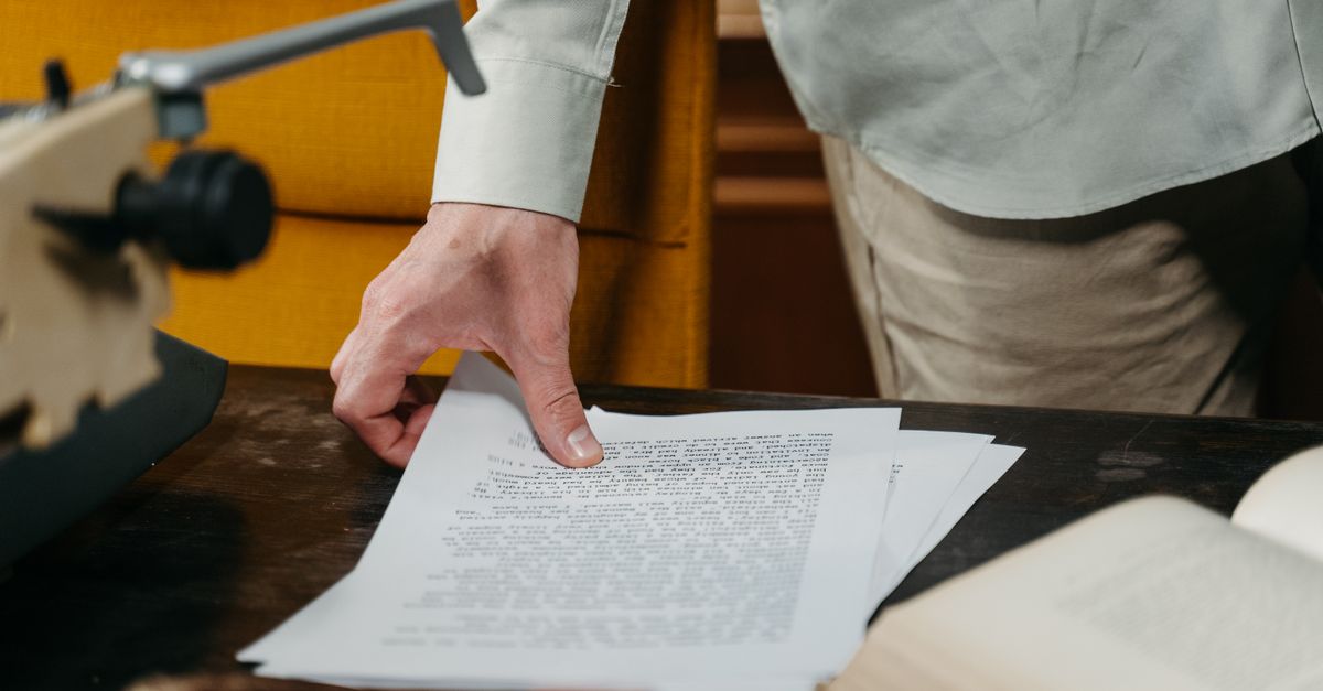
If you want a clean handoff to your book designer, do the opposite of what feels productive: stop styling your manuscript and start structuring it. Send a plain Word file that uses real paragraph styles to mark what each line is — a chapter heading, body text, a block quote — and strip out everything that controls how it looks. The designer rebuilds the visual look from scratch in professional software, so your fonts, colors, drop caps, and hand-tweaked spacing are not just unnecessary — they actively slow the job down and can raise your bill.
This is the single most misunderstood step in self-publishing. Authors spend hours making a Word document feel like a finished book, then feel deflated when a designer asks them to undo most of it. Once you see how your file actually moves through the production pipeline, the right approach becomes obvious.
Why your beautiful Word file gets thrown away
Here is what happens to a manuscript when it reaches a professional. Your text is poured into a layout program — usually Adobe InDesign — where the designer has already built a template: the trim size, margins, typeface, chapter-opening treatment, running heads, and page numbers. When your Word text flows into that framework, the program reads your paragraph styles and maps them to the designed elements. Direct formatting you applied by hand is either ignored or, worse, has to be manually purged line by line.
So that flourishy drop-cap font you chose, the gray sidebar boxes, the three header sizes you color-coded, the page numbers you typed in, the centered epigraphs — all of it vanishes or becomes a cleanup task. An over-decorated manuscript is one of the few things that reliably makes typesetting cost more, because someone has to charge for the hours spent removing your art direction before the real work starts.
Consistency, not prettiness, is the mark of a clean manuscript. Whatever structural choice you make, make it the same way every single time — every chapter title styled identically, every block quote tagged the same — and your designer can move fast and error-free.
Format means structure, not style
The word formatting trips people up because it sounds visual. In production, format means structure: it tells the designer the role of each piece of text. A line is a Heading 1, or a Heading 2, or body text, or a caption, or a block quote. That is a statement about function, not appearance.
The mechanism that carries structure is Word paragraph styles. Instead of selecting your chapter title and bumping it to 24-point bold centered, you put your cursor in that line and apply the Heading 1 style. It might look plain on your screen — and that is fine. You have told the software this is a top-level heading, and the designer decides what a top-level heading looks like in the finished book.
If you have never used styles, this is the highest-leverage Word skill an author can learn. A few minutes spent applying Heading 1, Heading 2, and Normal correctly will do more for your production timeline than any amount of cosmetic fiddling. Many indie authors hand this stage to an editor or a professional editing service so the manuscript arrives structurally clean and consistent.
The clean-manuscript checklist
Before you send your file, walk this list. Check with your specific designer too, since preferences vary, but these guidelines hold almost everywhere.
- Use one consistent body font at one size throughout. Times New Roman or Calibri at 12 point is perfectly fine. The designer changes it later.
- Apply paragraph styles for every structural level — headings, subheadings, body, block quotes, captions — rather than formatting by hand.
- Set first-line indents through the style, never with tabs or spaces. A row of spaces to fake an indent becomes a mess in layout.
- Use a single paragraph break between paragraphs. Do not press Enter several times to push a chapter onto a new page — insert a proper page break instead, or just let the designer handle chapter starts.
- Delete all tracked changes and margin comments. Accept or reject every edit first. Your designer is not there to settle lingering questions between you and your editor.
- Do not add page numbers, headers, or footers. These are built in the layout. Whatever you type will be discarded.
- Leave em dashes tight — no extra spaces around them unless your style guide says otherwise — and use real em dashes, not two hyphens.
- Skip the decorative extras: no dingbats, no colored text, no shaded boxes, no custom drop caps. Those are design decisions made in advance with your designer.
How to handle images the right way
Photos and illustrations are where manuscripts go sideways. Do not paste final images into the Word file. Print-resolution images are huge, they bloat the document, and Word compresses them anyway.
Instead, mark placement with a clear text callout exactly where the image belongs, like this: [photo 35.jpg: My sister, left, and I hiked the Grand Canyon in 2016]. Include the file name, the caption, and — if you are producing an EPUB — the alt text for accessibility. Then deliver the actual high-resolution files as separate items in a folder, named or numbered to match every in-text callout. Because these files are large, send them through Dropbox, Google Drive, or another transfer service rather than email. This same discipline keeps your ebook files and your print files in sync.
Decide format and trim size before design starts
The designer usually begins not with your text but with three decisions: the finished page size, the cover type, and which versions you are producing. These shape every layout choice that follows, so settle them early.
| Decision | Common options | Why it matters |
|---|---|---|
| Trim size | 6 x 9 in (nonfiction), 5.5 x 8.5 in (fiction), 5 x 8 in (compact) | Sets page count and what feels right next to comparable titles on a shelf. |
| Cover type | Softcover, hardcover, dust jacket | Changes spine treatment, durability, price, and reader expectation. |
| Versions | Paperback, hardcover, ebook, audiobook | Each format needs its own prepared files and its own design pass. |
| Page count target | Driven by word count and trim size | A short book in a large trim can leave the spine too narrow for text. |
These are not arbitrary. Trim size is guided by genre norms, bookstore and reader expectations, and length. A skilled designer knows the tricks — widening margins to bulk up a thin book, or tightening the trim so a long manuscript stays affordable to print. That is exactly the kind of judgment that separates a polished book from an obviously self-made one, and it is why print-on-demand and book printing choices belong in the conversation up front, not after layout is done.
What most guides get wrong
Plenty of formatting advice tells authors to buy software like Atticus or Vellum and lay the book out themselves. Those tools are genuinely good, and for a straightforward novel headed only to ebook and basic paperback, they can carry you all the way. But here is the part those guides skip: if you are also working with a human designer for a custom interior or a more complex book — heavy illustration, sidebars, tables, a leadership title with structured callouts — then a manuscript you already laid out in Vellum is not a head start. It is a file the designer has to unwind back into clean structure before real design can begin.
The smarter move is to ask one question before you touch a single style: what can I do to make your work easier and more accurate, so you can focus on design instead of cleanup? That single question, asked early, saves more time and money than any formatting trick. A clean, consistently structured Word file is the most valuable thing you can hand a designer, full stop.
Getting structure right at the manuscript stage pays off everywhere downstream — your cover design, interior layout, and every format you release stay consistent and predictable. This is the foundation that lets a book look professionally made rather than improvised.
Hand off clean, publish with confidence
You wrote the book — now protect the work by handing it over the way a professional expects: structured, consistent, and free of cosmetic clutter. If you would rather spend your energy on the writing and let specialists handle the structure, typesetting, and production, LaunchPad Books helps authors publish, print, and promote their books while keeping every right and every royalty. Tell us where your manuscript stands and we will map the cleanest path to a finished book. Start with a free consultation or explore full self-publishing support, and turn that clean file into a book you are proud to put on a shelf.
Source: Jane Friedman
Ready to publish your book?
Talk to a real publishing advisor — free, no pressure.
Frequently asked questions
Should I design my manuscript in Word before sending it to a book designer?
No. Anything visual you add — fonts, colors, drop caps, page numbers, manual spacing — gets stripped out when the file flows into design software like InDesign. Your job is to mark structure with Word styles, not to mimic the finished page. Over-designed files often cost more because the designer has to clean them first.
What does formatting a manuscript actually mean?
Formatting in this context means tagging structure, not styling appearance. You use Word paragraph styles to say what each line is — Heading 1, Heading 2, body text, block quote, caption — so the designer can map each tag to a designed element. It tells the designer the role of the text, not what it should look like.
How do I include images in my manuscript?
Do not embed final images in the Word file. Insert a text callout where each image belongs, such as [photo 35.jpg: caption text here], and deliver the actual high-resolution files separately in a folder with matching names. Print images are large, so share them via Dropbox or Google Drive rather than email.
What book size should I choose before formatting?
Common trim sizes are 6 x 9 inches for nonfiction and 5.5 x 8.5 inches for fiction, but the right choice depends on genre, page count, and comparable titles. Decide trim size, cover type, and which formats — paperback, hardcover, ebook, audiobook — before design begins, since each changes the layout.