Publishing News
How to Format a Manuscript for Self-Publishing
LaunchPad Books Editorial ·

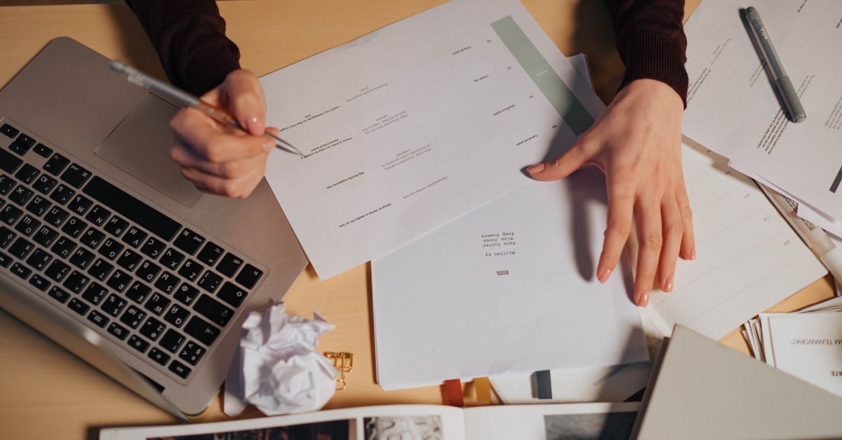
Here is the short answer most formatting guides bury: to format a manuscript for self-publishing, keep your Word file structural and boring. Use built-in heading styles, a single readable font, one space after each period, automatic chapter breaks, and absolutely no decorative design. Then hand it to your designer clean. Everything you add to make the manuscript look like a finished book gets stripped out anyway — and it can cost you extra to remove.
That last part is what trips up so many first-time authors. You spend hours making your chapter openings look gorgeous in Word, Vellum, or Atticus, only to learn that a professional book designer flattens all of it before laying out a single page. The manuscript is not the place for your aesthetic. It is a structured text file that flows into layout software, and the cleaner it is, the better your finished book looks.
Why your designer wants a plain manuscript, not a pretty one
When you self-publish properly, your interior pages are typeset — usually in Adobe InDesign — from the text you provide. The designer maps your Word styles to a custom page layout: trim size, margins, running heads, chapter openers, body typeface, the works. If your file is clean, your words pour straight into that framework. If it is loaded with manual formatting, the designer has to undo your work before they can start theirs.
Think about what that means for your budget. Decorative formatting does not save the designer a step. It adds one. Many designers quote a higher price for an over-formatted manuscript purely for the cleanup hassle. The single best question you can ask before you deliver files is this: what can I do to make your work easier and more accurate, so you can focus on design instead of cleanup?
The manuscript is not the place to indicate your design preferences. Those are decisions you and your designer make together, in advance, when building the custom layout for your book.
Decide the physical book first
Before formatting matters, the designer needs to know what kind of object they are building. Trim size, cover type, and format all change the design math.
- Trim size — common choices include 5.5 x 8.5 and 6 x 9 inches. The right size depends on your genre, your page count, and what readers expect on the shelf.
- Cover type — paperback, hardcover, or hardcover with a dust jacket. Each affects spine width and production cost.
- Formats — print, ebook, and audiobook each have different requirements, so flag which ones you want early.
These are not afterthoughts. Specify too large a trim for a short book and the spine may be too narrow to print text on. Designers know the tricks — wider margins to bulk up a thin book, tighter leading to control page count — but they need to understand your goals to apply them. If you are still mapping out your path, our overview of self-publishing services walks through these decisions in order.
How to format a manuscript for self-publishing: the clean-file checklist
Consistency is the single most important feature of a clean manuscript. Whatever you do, do it the same way every time. In this context, formatting is not design — it is structure. Format tells the designer what each line is: a chapter title, a subhead, body text, a caption, a block quote. It does not tell them what those elements should look like.
- Use Word styles, not manual formatting. Apply Heading 1 to chapter titles, Heading 2 and Heading 3 to subheads, and Normal to body text. Styles are how layout software reads your structure. Manually bolding a line and bumping the font size tells the designer nothing.
- One font, one size. A single readable typeface such as Times New Roman or Garamond at 12 point is plenty. Color, mixed fonts, and varied sizes only create cleanup.
- Let chapters break automatically. Use a page break or a style that starts each chapter on a new page. Never hit Enter repeatedly to push text down — those phantom returns wreak havoc in InDesign.
- One space after periods. The double-space habit from typewriter days has to go. Modern typesetting uses a single space.
- Use real em dashes, set tight. Type a proper em dash and do not pad it with spaces on each side because you think it looks better. The designer controls that spacing in layout.
- Drop the manual page numbers, headers, and footers. Running heads and folios are generated by the layout software. Anything you add will be deleted.
- Skip the bling entirely. No drop caps, no dingbats, no gray sidebars, no centered decorative epigraphs styled by hand. Mark what a line is; let the designer make it beautiful.
- Strip tracked changes and comments. Accept or reject every edit and delete all marginal notes. Your designer should never have to referee a lingering question between you and your editor.
What gets stripped versus what survives
It helps to see the line between structure (which the designer keeps and uses) and decoration (which disappears). Here is the quick reference.
| What you put in Word | What happens in typesetting |
|---|---|
| Heading 1 / Heading 2 styles | Kept — mapped to chapter and section styles |
| Italic and bold for emphasis | Kept — carried through as character formatting |
| Block quote style | Kept — mapped to a quote style |
| Custom fonts and colors | Stripped — replaced by the layout typefaces |
| Hand-built drop caps and dingbats | Stripped — recreated as real design |
| Manual page numbers and headers | Stripped — generated automatically |
| Extra returns and tabs for spacing | Stripped — and a cleanup headache |
| Tracked changes and comments | Must be removed before delivery |
Handling images, photos, and graphics
Never paste images directly into the manuscript and expect them to print. Word compresses pasted images, and print layouts need high-resolution originals. Instead, mark placement in the text and deliver the real files separately.
Show suggested placement with a bracketed callout right where the image belongs, including the file name, the caption, and alt text if you are producing an EPUB. For example: [photo-35.jpg: My sister, left, and I hiked the Grand Canyon in 2016]. Then collect every high-resolution image, graphic, and illustration in a folder, named or numbered to match the in-text callouts. Print-quality files are large, so send them via Dropbox, Google Drive, or another transfer service rather than email.
This separation matters most for illustrated nonfiction, cookbooks, children's books, and anything where images carry the content. If your book leans heavily on visuals, it is worth talking through specs before you write a single callout, especially if you plan ebook and EPUB editions alongside print.
What most authors get wrong
The mistake is not laziness — it is the opposite. Authors over-prepare. They assume a polished-looking Word file signals professionalism, when it actually signals more cleanup. The pros who format manuscripts all day know that a plain, consistently styled document is the gift, not the lavishly decorated one.
The second common error is treating editing and design as the same stage. They are not. Your manuscript should be fully edited and proofread before it goes to a designer, with all tracked changes resolved. Sending an unfinished manuscript into layout guarantees expensive revision rounds once the text starts shifting across typeset pages.
And remember that the manuscript is only one input. The cover is its own craft — a strong professional cover design sells the book, while the interior typesetting and print-on-demand production make it a real, shelf-ready object. Keeping these jobs separate, and feeding each one a clean file, is how indie books end up looking traditionally published.
A clean manuscript is the cheapest upgrade you will ever make
Formatting your manuscript correctly costs you nothing but restraint. Style your text, stay consistent, strip the decoration, resolve your edits, and package your images cleanly. Do that and your designer spends their time making your book beautiful instead of dismantling your good intentions — which means a better-looking book, fewer errors, and a smaller invoice.
If you would rather hand the whole production to a team that keeps you in control of every right and every royalty, LaunchPad Books can take your finished manuscript and turn it into a polished print, ebook, and audiobook edition. Start your project with a free consultation and we will tell you exactly how to prep your files, what your book will look like, and what it will cost — before you commit to anything.
Source: Jane Friedman
Ready to publish your book?
Talk to a real publishing advisor — free, no pressure.
Frequently asked questions
Should I design my manuscript in Word before sending it to a book designer?
No. Anything decorative you add in Word — drop caps, colored headers, gray boxes, custom fonts — gets stripped out during professional typesetting. Worse, it can slow your designer down and increase your cost. Keep the file structural, not pretty, and let the designer handle the look in InDesign.
What file format do book designers want for a manuscript?
A clean Microsoft Word .docx file is the industry standard for interior typesetting. Designers import it into layout software such as InDesign. Send images as separate high-resolution files in a folder rather than pasting them into the document, and use in-text callouts to mark placement.
How do I mark image placement in a manuscript?
Place a bracketed note exactly where the image should sit, including the file name and caption, like [photo-35.jpg: My sister and I at the Grand Canyon, 2016]. Then deliver the actual image files separately, named to match each callout, via Dropbox or Google Drive.
Do Word styles really matter for self-publishing?
Yes. Word styles such as Heading 1, Heading 2, and Normal tell the designer the structure of your book — what is a chapter title versus a subhead versus body text. Consistent styles flow cleanly into layout software and prevent the manual cleanup that costs you time and money.