Publishing News
How to Format a Manuscript for a Book Designer
LaunchPad Books Editorial ·

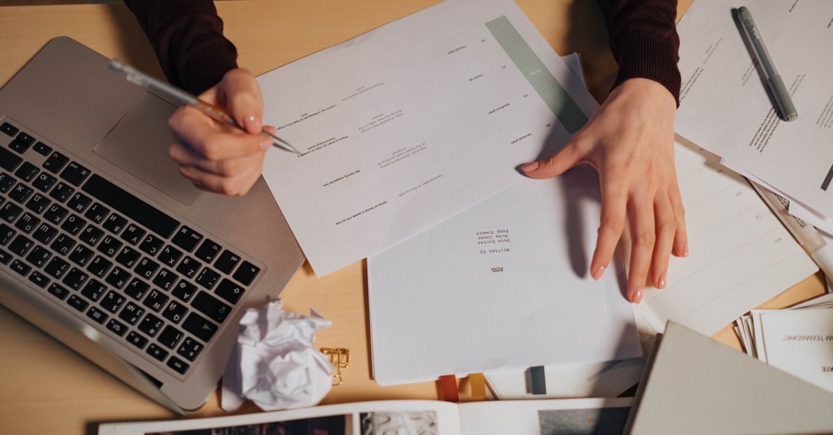
Here is the short answer: format a manuscript for a book designer by handing over a clean Word file that uses built-in paragraph styles to mark structure — chapter title, body, block quote — and nothing that tries to dictate how the page should look. The visual design is the designer's job, and almost everything decorative you add in Word gets stripped out the moment your file enters professional typesetting software.
That single shift in thinking saves you money, prevents errors, and lets your designer spend their hours on craft instead of cleanup. Below is exactly how to prepare your file, what to strip out, and the small habits that make a designer quietly grateful to work with you.
The manuscript is for structure, not styling
Authors and even some copy editors love to play art director. You picture flourishy drop caps for your 90,000-word romantasy, or crisp gray callout boxes and custom dingbats for your leadership book. So you start nudging font sizes, centering epigraphs, adding spaces around every em dash, and inserting page numbers. It feels productive. It looks finished.
It all gets deleted. Poof.
When your file lands in a designer's software — usually Adobe InDesign — the layout is rebuilt from the ground up inside a custom framework. Your manual choices do not carry over; they get overridden by the real design. Worse, stray formatting and hidden coding can fight with the import, creating mystery errors the designer then has to hunt down. An over-formatted manuscript is not a head start. It is a mess someone has to undo, and many designers charge extra for exactly that hassle.
Consistency is the single most important feature of a clean manuscript. Whatever you do to mark up your file, do it the same way every single time — that is what lets your words flow cleanly into the design.
Format means tagging, not decorating
In book production, the word format does not mean how something looks. It means telling the designer what each line is. Is this line a chapter heading? A subheading? Body text? A caption? A block quote? That structural map is what the designer needs, and Word already gives you the perfect tool for it: paragraph styles.
Instead of manually making a chapter title big and bold, highlight it and apply the Heading 1 style. For a subhead, use Heading 2. Leave body text as Normal. When you tag elements this way, the designer can map your Heading 1 to their chapter-title design in one move, and every chapter updates at once. When you fake it with manual bold and font sizes, the designer has to find and re-tag each element by hand.
This is also where good editing pays off. If you are working with a professional through structured editorial support, ask your editor to apply styles consistently as part of the final pass — it turns a clean edit into a designer-ready file with almost no extra effort.
A quick style map most books need
| Element in your book | Word style to apply | What you should NOT do |
|---|---|---|
| Chapter title | Heading 1 | Type it large, bold, and centered by hand |
| Section subhead | Heading 2 or Heading 3 | Use random colors or font sizes per level |
| Body paragraphs | Normal / Body Text | Add manual line spacing or blank lines |
| Block quote or epigraph | Quote style | Center it and indent with the space bar |
| Image caption | Caption style | Italicize and shrink it manually |
What to strip out before you hit send
A clean handoff is mostly about subtraction. Before you deliver your manuscript, remove the clutter that causes the most trouble during typesetting:
- Tracked changes and comments. Accept or reject everything and clear all marginal notes. The designer is not there to settle lingering questions between you and your editor — leftover tracking just creates confusion and risk.
- Manual page breaks and blank lines. Do not press Enter a dozen times to push a chapter to a new page. The designer controls page breaks in their software, and a stack of empty paragraphs throws off the flow.
- Page numbers, headers, and footers. These are generated automatically during layout. Yours will be deleted.
- Decorative fonts, colors, and drop caps. Save your aesthetic wishes for a separate note or a reference image. Do not bake them into the file.
- Spaces around em dashes and double spaces after periods. Use a clean find-and-replace to remove them. Typesetting handles spacing.
- Manual indents made with the space bar or tabs. Let the paragraph style control indentation instead.
What most guides get wrong is framing this as a list of restrictions. It is the opposite. Every item you remove is one less thing standing between your words and a beautiful printed page — and one less line item on your invoice.
How to handle images and graphics the right way
Never paste images directly into your Word file and assume that is enough. Screen-resolution images embedded in a document are useless for print, and they bloat the file. Instead, mark placement in the text and deliver the real files separately.
In the manuscript, drop a plain bracketed callout exactly where the image belongs:
[photo 35.jpg: My sister (left) and I hiked the Grand Canyon in 2016.]
That single line tells the designer the file name, the position, and the caption — and if you are producing an EPUB, add the alt text there too. Then gather your actual high-resolution images, illustrations, and graphics into a clearly named folder, with file names that match every in-text callout. Print images are large, so send the folder through Dropbox, Google Drive, or another transfer service rather than email. This matters whether you are heading toward print-on-demand or a traditional book printing run, because the designer needs the same clean assets either way.
Decide the big-picture specs early
Before design even begins, your designer needs a few decisions from you, because they shape every later choice:
- Trim size. Common options are 6 x 9 or 5.5 x 8.5 inches, chosen against comparable books in your genre and reader expectations. Pick too large a size for a short book and the spine may be too thin to print text on.
- Cover type. Softcover, hardcover, or hardcover with a dust jacket — each changes the layout and the budget.
- Formats. Paperback, hardcover, ebook, and audiobook versions each have different production needs, so flag which ones you want up front.
Designers know the tricks of the trade — bulking a short book with generous margins, balancing spine width against page count — but they can only apply them when they understand your goals. A quick conversation here prevents expensive rework later, and it pairs naturally with strong professional cover design so the inside and outside of your book feel like one cohesive object.
Ask the one question that changes everything
The smartest thing any author can do is ask the designer, before sending a single file: What can I do to make your work easier, more efficient, and more accurate, so you can focus on the design instead of the cleanup?
That question signals you respect the craft, and it gets you their specific preferences — some want a particular style naming convention, some have a manuscript template, some prefer images delivered a certain way. Five minutes of asking saves hours of fixing.
This clean-handoff mindset is the same discipline that makes the whole journey smoother, from manuscript to finished book. If you would rather keep your energy on the writing, LaunchPad Books helps authors publish, print, and promote their books while keeping every right and every royalty — including the editing, formatting, and design steps that turn a Word file into a book readers want to hold.
Get your manuscript design-ready
Your job is to write the darn book and hand over a clean, consistent file. The design magic is ours to handle. If you want a team that will take your tidy manuscript and turn it into a professionally typeset, print-ready book without losing your rights or your royalties, start with a free consultation and we will map out the fastest, cleanest path from your final draft to a finished book. Bring the words — we will build the pages.
Source: Jane Friedman
Ready to publish your book?
Talk to a real publishing advisor — free, no pressure.
Frequently asked questions
Should I design my manuscript in Word before sending it to a book designer?
No. Anything decorative you add — fancy fonts, drop caps, gray boxes, manual page numbers — gets stripped out during typesetting and can actually cost you more in cleanup time. Mark structure with paragraph styles instead and let the designer handle the visual layout in InDesign.
What does a book designer actually need from my Word file?
A clean, consistent file where every element is tagged with the correct paragraph style: Heading 1 for chapter titles, Normal or Body for text, and dedicated styles for block quotes, captions, and subheads. Remove tracked changes and comments, and supply images as separate high-resolution files.
How should I mark image placement in my manuscript?
Use a plain bracketed callout in the text where the image belongs, like [photo 35.jpg: My sister and I at the Grand Canyon, 2016.]. Then deliver the actual high-resolution files in a separate folder with names that match the callouts, sent via Dropbox or Google Drive.
Why does an over-formatted manuscript cost more?
Designers often charge extra to undo unnecessary formatting — manual spacing, inconsistent fonts, hard page breaks, and stray coding all have to be cleaned out before the file can flow into the design software. A tidy file means the designer spends time on design, not cleanup, which keeps your quote lower.