Publishing News
Format Your Manuscript for Book Design Without Wasting Money
LaunchPad Books Editorial ·

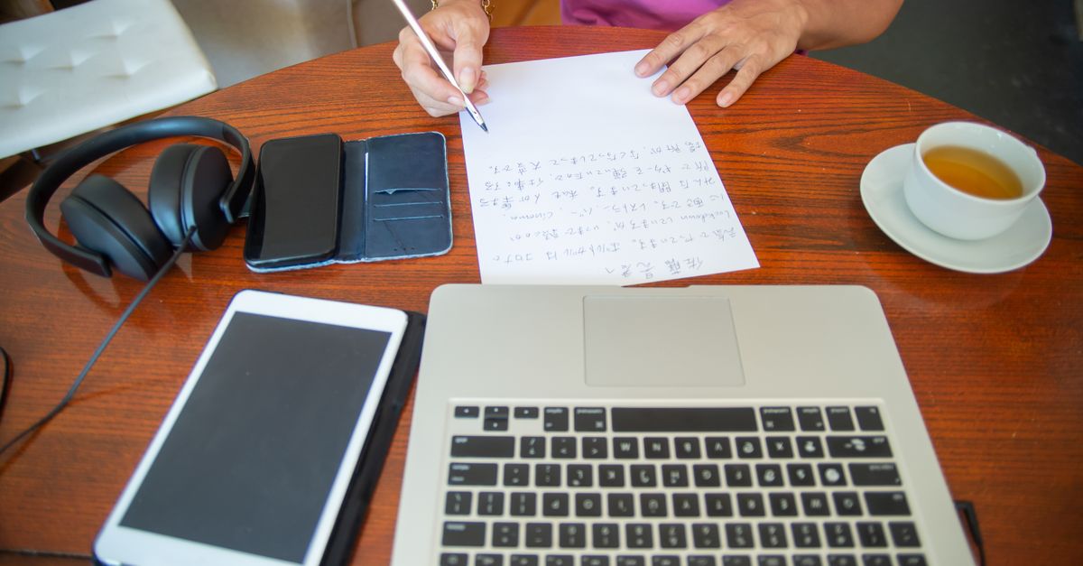
To format a manuscript for book design, hand your designer a clean Word document that uses styles to mark structure — not one decorated to look pretty. Label what each line is (heading, body, block quote) and leave the fonts, drop caps, and spacing to the professional. That single shift saves you time, money, and a frustrated designer.
Here is the uncomfortable truth most first-time authors learn too late: nearly all of the visual formatting you lovingly added in Word gets thrown away. The fancy chapter fonts, the gray sidebars, the hand-tuned line spacing — poof. When your file flows into professional layout software, that bling does not survive. It just makes the cleanup longer and your invoice bigger.
Why your manuscript is not the place for design
A manuscript has one job: carry your words and tell the designer what each chunk of text is. That is structure. Design — how the pages actually look — is a separate craft that happens later, usually in Adobe InDesign, where a designer builds a custom layout for your trim size, fonts, and ornaments.
When you play art director inside Word, you are guessing at decisions a designer makes deliberately. You center an epigraph, bold a subhead, bump a font to 16 point, add spaces around your em dashes because they looked nicer on screen. None of it transfers. The designer has to find and undo every one of those choices before the real work can begin.
This is the part that costs you. Many designers quote a higher price for a heavily formatted file simply because of the cleanup hassle. A clean document, by contrast, drops straight into their framework and frees them to focus on the design you are actually paying for.
If you remember one thing: format tells the designer what a line is, design decides how it looks. Mark the structure, then get out of the way.
Format versus design — the distinction that saves you money
Formatting and design sound like the same thing. They are not.
Formatting is structural labeling. This line is a chapter title. This is a subheading. This is body text. This is a block quote, a caption, an epigraph. You are telling the designer the role each element plays.
Design is the visual answer to that structure. The designer decides the chapter title is 28 point in a particular serif, centered, with 60 points of space above it. You should never make that call inside your Word file — because the moment your text enters the layout software, the designer maps your structural labels to the real visual styles.
The mechanism that makes this work is paragraph styles. Instead of manually bolding a heading, you apply Word's built-in Heading 1 style. Instead of eyeballing your body text, you apply the Normal or Body style consistently. When the file imports, the designer remaps Heading 1 to their chapter design in one move — across the whole book. That is the entire reason styles exist, and almost no first-time author uses them.
A clean-manuscript checklist before you hand off
Consistency is the single most important feature of a clean manuscript. Whatever you do, do it the same way every time. Always confirm preferences with your designer first, then work through this list.
- Use paragraph styles, not manual formatting. Mark headings, subheadings, body, block quotes, and captions with named styles applied consistently throughout.
- Accept all tracked changes and delete every comment. Lingering editorial notes and margin queries are not the designer's job to resolve. The file should be final.
- Remove manual page breaks and rows of empty paragraphs. Do not press Enter repeatedly to push a chapter to a new page — the designer controls page breaks in layout.
- Use one space after periods, never two. And do not add spaces around em dashes; type them as solid em dashes.
- Drop the decorative fonts, colors, drop caps, dingbats, and gray boxes. Those are design decisions made later.
- Skip manual page numbers, headers, and footers. The layout software generates these.
- Turn off automatic hyphenation and any manual line breaks inside paragraphs.
- Use real lists. Apply Word's numbered or bulleted list styles instead of typing numbers and dashes by hand.
One quiet exception worth respecting: italics and bold that carry meaning — a book title, emphasis, a foreign phrase — should stay, because they are content, not decoration. Strip the ornamental styling, keep the meaningful styling.
How to hand off images and graphics
Embedding pictures inside a Word file is one of the most common mistakes — and one of the most avoidable. The image you see in Word is a low-resolution preview; it is not print quality, and it bloats the file.
Instead, mark the spot with a text callout where the image belongs, then deliver the real files separately. A clean callout looks like this: [photo 35.jpg: My sister (left) and I hiked the Grand Canyon in 2016.] If you are producing an EPUB, include alt text in the callout too, since accessible ebook publishing depends on it.
Then collect every high-resolution image, illustration, and graphic in one folder, named or numbered to match each in-text callout exactly. Print images are large, so send them through Dropbox, Google Drive, or another transfer service rather than email.
Decide the big things before design even starts
Before a designer touches a page, a few upstream choices shape everything: the finished trim size (6 x 9, 5.5 x 8.5, or something else), the cover type (softcover, hardcover, jacketed), and which versions you need — paperback, hardcover, ebook, audiobook.
These are not cosmetic. Trim size interacts with page count and spine width; specify too large a size for a short book and the spine can become too narrow to print text on. Designers know the tricks — wider margins to bulk up a slim book, comparable-title research to match reader expectations — but they need to understand your goals to apply them. This is exactly where a conversation with your cover design team early pays off, and where the broader path of self-publishing decisions start to connect.
| Element | Author handles (formatting) | Designer handles (design) |
|---|---|---|
| Headings | Apply Heading styles consistently | Font, size, spacing, alignment |
| Chapter starts | Use a New Chapter style or page-break style | Drop caps, ornaments, opening art |
| Body text | One clean Body style, single spacing of spaces | Typeface, leading, margins, justification |
| Images | Text callouts plus separate high-res files | Placement, sizing, captions styling |
| Page numbers | Leave them out entirely | Generated in layout software |
What most guides get wrong
Most formatting advice tells you to make your manuscript look like a book. That is backwards. The cleaner and plainer your file looks, the better it performs in production. A manuscript that looks boring in Word is often the one that flows flawlessly into a professional layout.
The single highest-leverage move you can make is to ask your designer one question before you start: what can I do to make your work easier and more accurate, so you can focus on design instead of cleanup? That question alone will surface their exact style preferences, their image-handoff method, and the quirks of their workflow — and it signals that you respect the craft. Designers remember the authors who ask it, and they do better work for them.
There is a deeper reason to get this right. Every hour your designer spends deleting your gray boxes is an hour not spent making your book beautiful. Clean structure is not just tidiness — it is how you redirect the budget toward the work that actually sells your book. The same logic carries into a professional editing pass and your eventual book printing setup: clean inputs, better output, lower cost.
Ready to hand off a manuscript your designer will love?
If you would rather spend your energy writing the next chapter than wrestling with styles and trim sizes, that is exactly the point — and exactly where we can help. LaunchPad Books helps authors publish, print, and promote their books while keeping every right and every royalty, so the polish happens without you losing control. Bring us a clean draft and our team will handle the structure, the layout, and the production details that turn a manuscript into a finished book. Get started with a free consultation and let us take the formatting headache off your desk so you can do the one job only you can do — write the darn book.
Source: Jane Friedman
Ready to publish your book?
Talk to a real publishing advisor — free, no pressure.
Frequently asked questions
How should I format my manuscript before sending it to a book designer?
Send one clean Word document that uses paragraph styles to label structure rather than appearance. Mark headings, body text, and block quotes with named styles, accept all tracked changes, remove comments, delete manual page breaks, and use a single space after periods. Provide images as separate high-resolution files with matching in-text callouts.
Does decorative formatting in Word carry over to the printed book?
No. Drop caps, fancy fonts, colored headers, gray boxes, and manual spacing get stripped out when your file flows into the designer software such as InDesign. Worse, heavy formatting can slow the designer down and increase your cost because they must clean it up before they can lay out the real design.
What is the difference between formatting and design in a manuscript?
Formatting tells the designer what each line is — a heading, body paragraph, caption, or block quote. Design decides how those elements look — fonts, sizes, spacing, and ornaments. Authors should handle structure with consistent styles and leave the visual design to the professional creating the page layout.
How do I send images for my book to a designer?
Place a text callout in the manuscript where the image belongs, such as the file name plus a caption, and deliver the actual files separately. Print images should be high resolution, named or numbered to match each callout, and shared through Dropbox, Google Drive, or another transfer service because the files are usually too large to embed.