Publishing News
Format Your Manuscript for Book Design the Right Way
LaunchPad Books Editorial ·

Stop prettying up your Word document. To format a manuscript for book design, you give your designer structure, not styling — apply built-in Word styles so each line is labeled (chapter title, heading, body text, block quote), strip out decorative fonts, colors, and manual spacing, turn off track changes, and mark images in brackets. That is the whole job. The fancy stuff you add gets deleted anyway.
It is a hard truth for authors who have spent weeks nudging margins and hunting for the perfect chapter-opening font: none of it survives. Interior layout happens in professional software, and your decorative choices are stripped on import. Worse, an over-designed file slows your designer down and often costs you more, because someone has to undo your work before the real design begins.
Here is how to hand off a manuscript that flows cleanly into design — and why doing less actually gets you a better-looking book.
Formatting is structure; design is the look
The single idea that fixes most messy manuscripts is this distinction. Formatting tells the designer what each piece of text is. Design decides how it looks. They are different jobs, owned by different people.
When you set a line as Heading 1 in Word, you are not choosing a 24-point bold font — you are saying this line is a chapter title. The designer then decides that chapter titles appear in a particular typeface, size, and position across the whole book. If instead you manually bold and enlarge that line, the designer has no reliable signal that it is a heading at all. They are left guessing, and guessing introduces errors.
Consistency is the most important feature of a clean manuscript. Whatever you do to mark structure, do it exactly the same way every single time — every chapter title with the same style, every block quote the same way. Inconsistency is what turns a one-day layout into a three-day cleanup.
Use Word styles — this is the real skill
Microsoft Word ships with a Styles panel for exactly this reason. Instead of selecting text and changing its appearance by hand, you apply a named style that travels with the text as a label. A few that matter for almost every book:
- Heading 1 for chapter titles.
- Heading 2 and Heading 3 for subheadings, used in strict order so the hierarchy is unambiguous.
- Normal or a dedicated Body style for running text.
- Quote or a block-quote style for extended quotations and epigraphs.
- A caption style for image captions.
Do this consistently and your designer can import the file and map each style to a designed element in seconds. Nonfiction authors gain an extra prize: heading styles are what Word and your ebook converter use to build an automatic table of contents and clickable navigation. Skip the styles and you lose that for free.
The decoration to delete before you send
Most authors are not malicious — they are trying to be helpful, or they simply enjoy the look of a tidy page. But almost everything in the list below should come out before hand-off, because it will be redone properly in layout.
| What authors add in Word | What to do instead |
|---|---|
| Decorative or flourishy fonts for chapter openings and drop caps | Leave the text plain — the designer creates drop caps and display type in layout |
| Different font sizes and colors for header levels | Use Heading 1, 2, 3 styles so hierarchy is clear without styling |
| Manual page breaks made with rows of Enter key presses | One clean page break (or let chapter styles handle it); never stack blank lines |
| Spaces around em dashes because they look better | Use the standard em dash with no manual spacing |
| Manually centered epigraphs, pull quotes, and headings | Apply the matching style; the designer sets alignment globally |
| Page numbers, highlighted sidebars, gray boxes, dingbats | Remove them — these are layout decisions made in design software |
What most guides get wrong is treating this as a list of rules to memorize. It is not. It is one principle: if a choice is about appearance, it belongs to the designer, so leave it out. When you are unsure, ask the single most useful question you can ask a book designer before a project: what can I do to make your work easier and more accurate, so you can focus on design instead of cleanup? Their answer is worth more than any generic checklist, because preferences vary by studio and by software.
Decisions that happen before design starts
A clean file is only half the hand-off. The other half is a set of choices that shape every design decision downstream, and they are best settled early with your designer or publishing team.
The designer usually begins by nailing down three things: the finished trim size of the pages (6 x 9, 5.5 x 8.5, or something else), the cover type (softcover, hardcover, or jacketed hardcover), and which formats you are producing — paperback, hardcover, ebook, audiobook, or some mix. These are not cosmetic. They are driven by comparable titles in your genre, bookstore and reader expectations, and your manuscripts length.
Length and size have to agree. Specify too large a trim for a short book and the spine becomes too narrow to print text on cleanly; designers may widen margins or adjust leading to give a slim book enough physical heft to feel substantial on a shelf. These are real tricks of the trade, and they only work when the designer understands your goals. If you are weighing formats, it helps to understand how print-on-demand and ebook production differ before you lock anything in, and how each affects the layout you are about to commission.
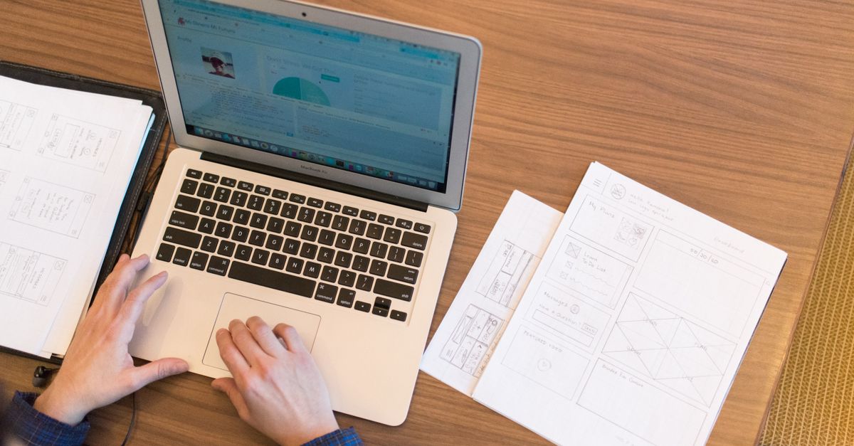
How to mark images, captions, and notes
Photos and illustrations cause more manuscript chaos than anything else, because authors tend to paste low-resolution images directly into Word. Do not. Screen-resolution images embedded in a document are useless for print and bloat the file.
Instead, mark each placement in the text with a bracketed callout that names the file and gives the caption, like this: [photo 35.jpg: My sister (left) and I hiked the Grand Canyon in 2016.] If you are producing an EPUB, include alt text in the same note so the ebook is accessible. Then deliver the actual high-resolution images, graphics, and illustrations as separate files in a folder, named or numbered to match the in-text callouts exactly. Print-quality image files are large, so send them through Dropbox, Google Drive, or another transfer service rather than email.
Two more housekeeping rules close the gap:
- Turn off and accept or remove all tracked changes, and delete leftover margin comments. The designers job is not to referee unresolved questions between you and your editor — that conversation should be finished before the file moves to design. If it is not, your manuscript is not ready, and that is a sign you may still need an editing pass first.
- Make sure the manuscript is genuinely final. Every change you request after layout begins is slower and more expensive to make in design software than it would have been in Word.
The payoff of doing less
It feels backward, but the cleanest manuscript is the one where you resisted the urge to design. You mark structure with styles, you strip the decoration, you settle trim size and format up front, and you hand over images the right way. In return, your designer spends their time on the part that actually makes your book beautiful — the custom interior and the cover design — instead of undoing your formatting.
That is also where keeping control of your project pays off. At LaunchPad Books we help authors publish, print, and promote their books while keeping every right and every royalty, which means the clean file you prepare goes straight into a layout built around your goals, not a template you have to fight.
Ready to turn a clean manuscript into a finished book? Bring us your final Word file and let our team handle the trim size, interior typesetting, and print-ready files for you — start with a free consultation and quote at get started, or compare your options first on our pricing page. You write the darn book; we will make it look like the one you imagined.
Source: Jane Friedman
Ready to publish your book?
Talk to a real publishing advisor — free, no pressure.
Frequently asked questions
Should I format my manuscript before sending it to a book designer?
Only structurally. Apply Word styles so the designer knows what is a heading, subheading, body paragraph, or block quote. Do not add decorative fonts, colors, drop caps, or manual page breaks for look — those get stripped and rebuilt in the designers software, and a messy file usually costs you more.
What file format do book designers prefer?
A clean Microsoft Word .docx is the standard hand-off for interior typesetting, because it flows cleanly into InDesign. Provide images as separate high-resolution files in a folder, with file names that match the bracketed callouts in your text, shared through Dropbox or Google Drive.
Why does my fancy manuscript formatting get deleted?
Interior design happens in professional layout software, not Word. The designer imports your text and applies a custom layout built around your trim size and cover type, so any fonts, spacing, or colors you added in Word are discarded. Keeping the file plain avoids cleanup time and errors.
What is the difference between formatting and design in a manuscript?
Formatting marks structure — this line is a chapter title, this is body text, this is a caption. Design decides how that structure looks — the fonts, margins, drop caps, and trim size. Authors handle structure with Word styles; the designer owns the look.