Publishing News
Format Your Manuscript for a Book Designer: Clean File Guide
LaunchPad Books Editorial ·

If you want to format your manuscript for a book designer the right way, the answer is almost the opposite of what most authors assume: stop designing it. Send a clean Word document that marks the structure of your book using paragraph styles, strip out the decorative fonts and spacing tricks, and hand over your images as separate high-resolution files. That single shift saves you time, prevents errors, and usually lowers your typesetting bill.
Here is the uncomfortable truth that editors and designers wish more authors knew: all the fancy formatting you lovingly added in Word gets thrown away. The flourishy chapter fonts, the gray boxes, the colored headers, the carefully centered epigraphs — poof. Gone. When your file lands in a professional designer's software, that bling is stripped out before real work even begins.
The manuscript is not the place for design
There is a difference between format and design, and confusing the two is the single most expensive mistake authors make at this stage.
Design is how the page looks: the typeface, the drop caps, the margins, the dingbats between scenes. Format is what each piece of text is: this line is a chapter title, this one is a subheading, this is body text, this is a block quote. Your designer needs the second thing. They do not need — and cannot use — the first.
So when you spend an afternoon making your romantasy chapter openers look magical in Word, or boxing out sidebars in your leadership book, you are not helping. You are creating cleanup. An over-formatted manuscript is harder to import, more error-prone, and more costly, because someone has to undo all of it before the actual interior typesetting can start.
Ask your designer one question before you send anything: What can I do to make your work easier, more accurate, and more efficient — so you focus on design instead of cleanup? That single email will save you both hours.
Use Word styles to mark structure, not looks
The professional way to prepare a file is to use Word's built-in paragraph styles. Instead of manually bolding a chapter title and bumping it to 18-point Garamond, you apply the Heading 1 style. Instead of eyeballing a block quote with indents and italics, you apply a block quote style consistently.
Why this matters: when your designer imports the document into software like InDesign, those styles map directly onto their custom layout. A file built on clean styles flows into the design framework almost automatically. A file built on manual formatting fights it every step of the way.
The golden rule here is consistency. Whatever convention you choose, apply it the same way throughout the entire manuscript. One chapter styled correctly and the next done by hand is worse than no styling at all.
What to strip out before you send
Most of the prep work is removal, not addition. Before you export your final file, clear out the things that quietly sabotage a clean import.
- Tracked changes and margin comments. Accept or reject everything and delete comment threads. Your designer is not there to settle lingering questions between you and your editor.
- Manual page breaks made with the Enter key. Hitting Enter a dozen times to push a chapter to a new page wreaks havoc on reflow. Let the designer handle page breaks.
- Custom line spacing and widow/orphan fiddling. You know widows and orphans are bad — but fixing them is the designer's job, done in the layout, not yours.
- Spaces around em dashes, double spaces after periods, and stray tabs. These look harmless and create real typesetting problems.
- Decorative fonts, colors, drop caps, dingbats, and gray boxes. All design decisions, all stripped, all best discussed in advance instead.
- Manual page numbers and headers/footers. The layout software generates these properly.
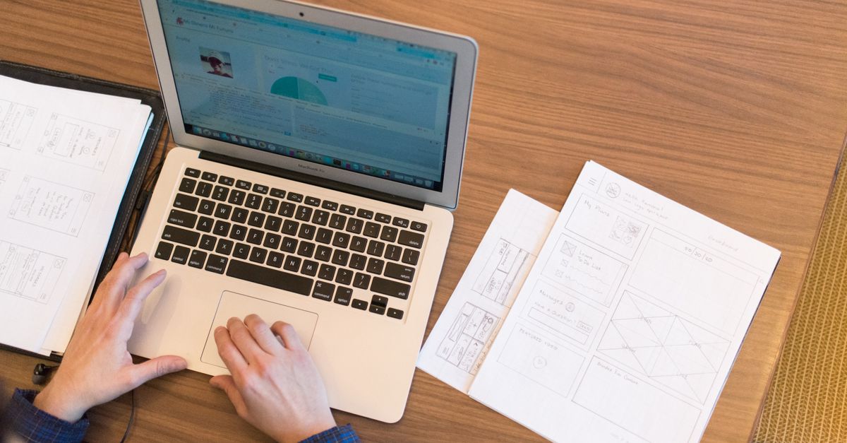
How to handle images and graphics
Embedding images directly in Word is one of the most common ways authors create headaches. Print-quality images are large, and a Word file is not a reliable container for them — resolution gets degraded and placement gets lost on import.
Instead, mark each image's intended spot with a clear, bracketed callout on its own line, then deliver the real files separately. A callout looks like this: [photo 35.jpg: My sister (left) and I hiked the Grand Canyon in 2016]. Include the file name, a caption, and — if you are producing an EPUB — alt text for accessibility.
Then gather every high-resolution image, illustration, and graphic into a single folder, naming each file to match its in-text callout. Because these files are big, send them through Dropbox, Google Drive, or another transfer service rather than email. If illustration or cover work is part of your project, your cover designer will thank you for an organized, clearly labeled asset folder.
Decide trim size and format first — they change everything
Before a single word is typeset, a good designer asks about the finished specifications, because they reshape every later choice.
| Decision | Why it matters |
|---|---|
| Trim size (6x9, 5.5x8.5, etc.) | Set by comparable titles, store expectations, and book length. Too large a size for a short book leaves a spine too narrow for legible text. |
| Cover type (soft, hard, jacketed) | Affects spine calculations, binding, and production cost — and which printer routes make sense. |
| Formats (paperback, hardcover, ebook, audiobook) | Each version has different layout rules; an EPUB needs reflowable text and alt text, while print needs fixed margins. |
| Page count and bulk | A short book can be bulked up with wider margins or heavier paper to earn a readable spine and shelf presence. |
These are not minor details — they are the foundation of the layout. The more clearly you and your editor communicate your goals, the better your designer can apply the tricks of the trade. If you are still weighing formats and editions, our overview of self-publishing options walks through how print and digital decisions fit together.
A simple pre-handoff checklist
- Confirm the file format and style preferences with your designer in writing.
- Accept all tracked changes and delete every comment.
- Apply consistent paragraph styles for each structural element.
- Remove manual page breaks, extra spacing, and decorative formatting.
- Add bracketed image callouts and assemble a separate, matching image folder.
- Lock in trim size, cover type, and which formats you are producing.
Do this, and you become the author every designer wants to work with — the one whose files flow in cleanly so the budget goes toward beautiful pages, not cleanup. If you also need editorial polish before the file is truly final, professional editing services catch the lingering issues that derail a smooth design hand-off.
Where most guides stop short
Plenty of articles tell you to use styles and remove tracked changes. What they rarely say is this: the cleanest manuscript in the world still costs you if you skip the conversation. The single highest-leverage move is talking to your designer before you finalize anything, because their preferences for styles, callouts, and file delivery vary — and matching them is what actually saves the money.
That collaborative approach is exactly how the best books come together, and it is the model LaunchPad Books is built around: we help authors write, publish, print, and promote their books while they keep every right and every royalty. A clean manuscript is your half of that partnership — and it is the half that pays off fastest.
Ready to turn your finished manuscript into a professionally designed, print-ready book? Get a free, no-pressure consultation and quote from the team at LaunchPad Books — explore our print and design services or simply get started today, and let us handle the typesetting so you can get back to what you do best: writing the next book.
Source: Jane Friedman
Ready to publish your book?
Talk to a real publishing advisor — free, no pressure.
Frequently asked questions
Should I design my manuscript in Word before sending it to a designer?
No. Your designer strips out fonts, colors, drop caps, and spacing anyway. Word should mark structure using styles — Heading 1, Heading 2, body text, block quote — not aesthetics. The visual design happens later in software like InDesign, based on choices you and the designer make together.
What file format do book designers prefer?
A clean Microsoft Word document (.docx) is the standard hand-off for interior typesetting because it flows cleanly into InDesign. Send images and illustrations as separate high-resolution files rather than embedding them, and confirm your designer's exact preferences before you export anything.
How do I mark where images go in my manuscript?
Use a clear in-text callout on its own line, like [photo 35.jpg: My sister and I at the Grand Canyon, 2016]. Then deliver the actual high-resolution files in a separate folder with names that match each callout, shared via Dropbox or Google Drive since print images are large.
Why does an over-formatted manuscript cost more?
Every decorative font, manual page break, double space, and colored header has to be located and removed before real typesetting begins. That cleanup is billable time. A clean, consistently styled file lets your designer spend their hours on design instead of janitorial work.